Yaser Hosainy
“What is your favorite artwork?”

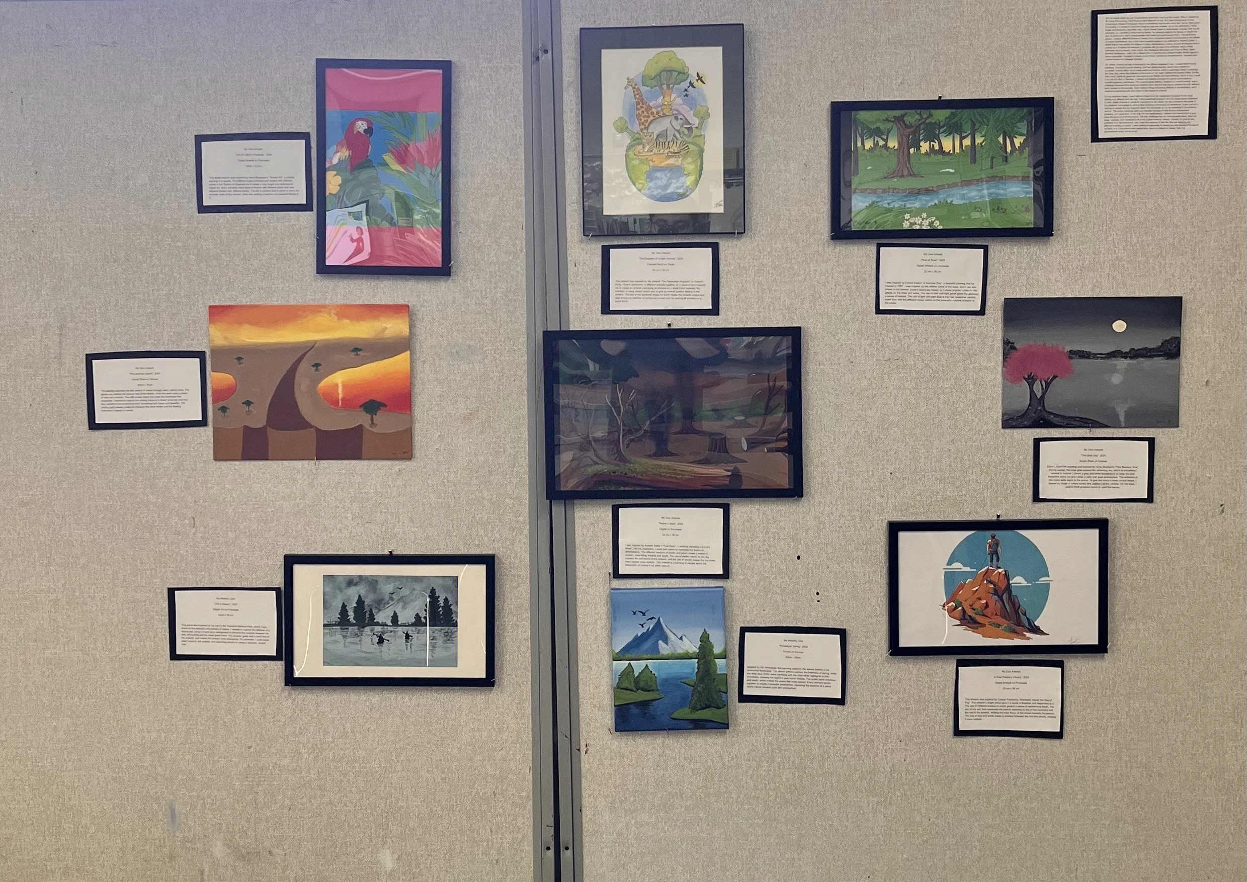
Curatorial Rationale
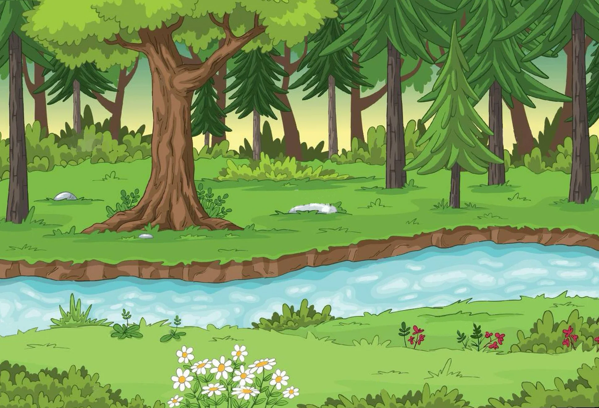
Art has always been my way of expressing ideas that I can’t put into words. When I started my IB Visual Arts journey, I didn’t have a clear direction at first, but I kept coming back to one thing-nature. Maybe it’s because nature is something that we see every day, yet we often take it for granted. Or maybe it’s because it feels so vast and endless, but at the same time, it feels fragile and temporary. But either way, I found myself drawn to landscapes, animals, and natural elements, so I decided to make that my theme. My artworks explore the beauty of nature but also its destruction, and it makes people think about the world around them. Throughout my pieces, I explore different aspects of nature, from untouched natural environments to the effects of human interference. One of the most important pieces in my collection is Nature’s Dead, a digital artwork that shows the effects of human interference in nature and the devastation that is caused by it. It stands out because it contrasts with the rest of my artworks, which mostly celebrate nature’s beauty. Other works, like Himalayan Mountains and Flow of River, depict beautiful landscapes, while Life in Nature and A Free Person’s Choice include human figures in nature peacefully. I wanted to include a mix of both, the beauty and destruction, because that contrast makes my message stronger.
My artistic choices are also influenced by the different materials I use. I created three acrylic paintings, one colored pencil drawing, and five digital artworks, which were created on procreate. Acrylics allow me to create depth and texture, which is especially useful in paintings like Gray Day, where the reflection of the moon on the water needed that layered effect. On the other hand, digital art gives me more control over details and color blending, which is why I used it for Life of a Bird in Paradise, a vibrant and detailed portrayal of a parrot surrounded by beautiful greenery and flowers. The colored pencil drawing, Kingdom of United Animals, was a challenge because of the precision required, but it was the best way to achieve the soft, blended look I wanted for the animals. Each medium brings something different to the exhibition, and I wanted to experiment with all of them to fully explore my theme.
For my exhibition setup, I want Nature’s Dead to be the centerpiece because it’s the most striking and different from the rest. I have specifically printed it out on a larger paper compared to other digital artworks to stress its importance to the viewer. It’s also located in the center of the exhibition surrounded by all the other artworks to showcase its importance. It also acts as a warning to people that the beautiful nature that surrounds us can be destroyed if it’s not taken care of. The acrylic paintings stand out naturally because of their texture and physical presence, so I wired them to the wall. For the digital pieces, I printed and framed them to give them the same level of importance. The only challenge was my colored pencil piece, since it’s larger vertically, but I managed to fit it into a glass frame for display. Overall, my goal for the exhibition is to feel immersive, and I want the audience to feel like they are stepping into different moments in nature. I want viewers to appreciate its beauty but also question the impact we have on it. If my works make people think about our impact on nature, then I’ve accomplished what I set out to do.
Mohammed’s Artwork
-
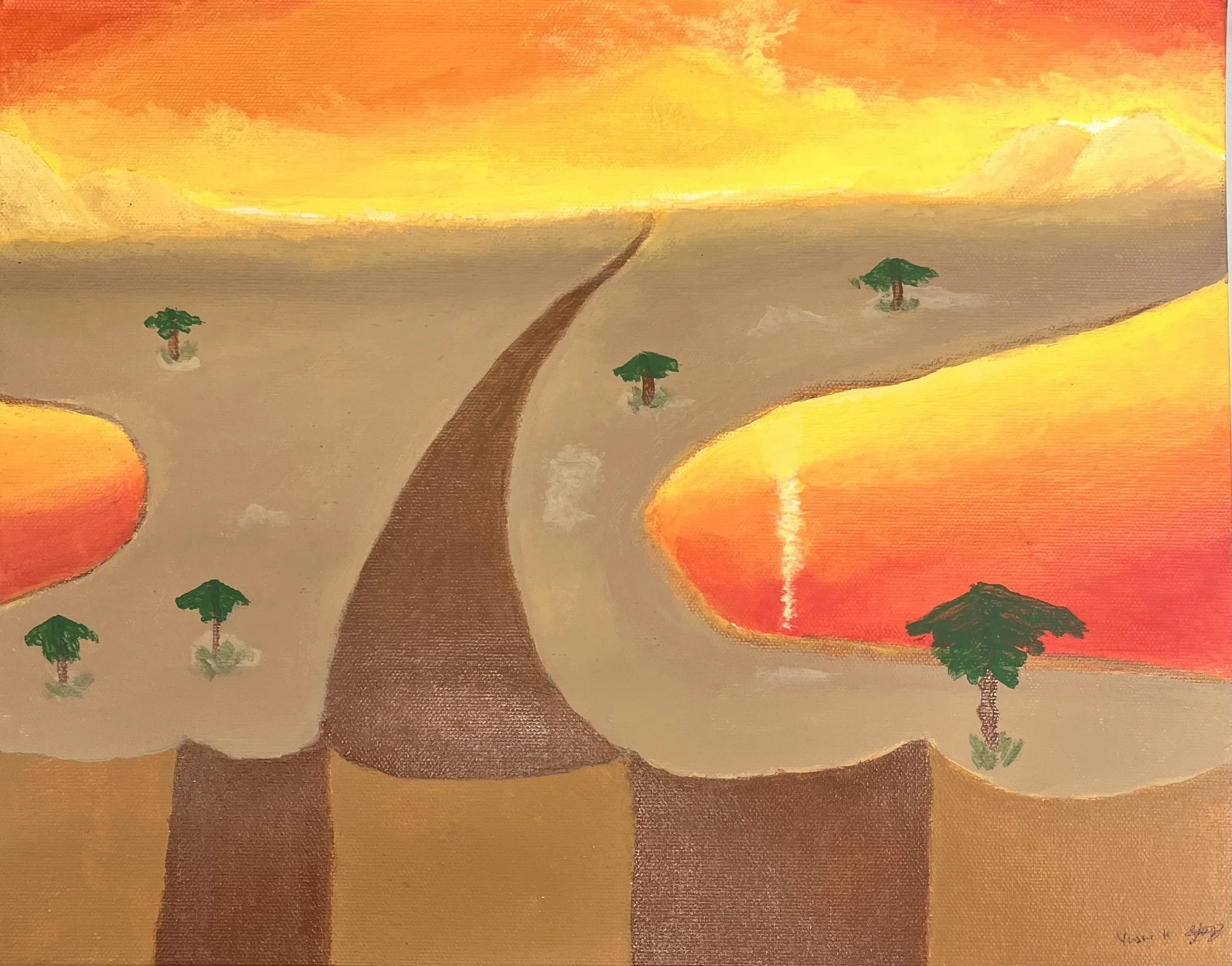
The Summer Desert
Acrylic Paint on Canvas
28cm x 35cm
This painting explores the vast beauty of nature through warm, earthy tones. The golden sky reflects the intense heat of the desert, while the water adds a sense of calm and contrast. The cliffs create depth and make the landscape feel expansive. I wanted to capture the striking colors of a desert at sunset and how they transform the environment into something both harsh and beautiful. The shifting light creates a balance between the harsh terrain and the fleeting moments of beauty in nature.
-
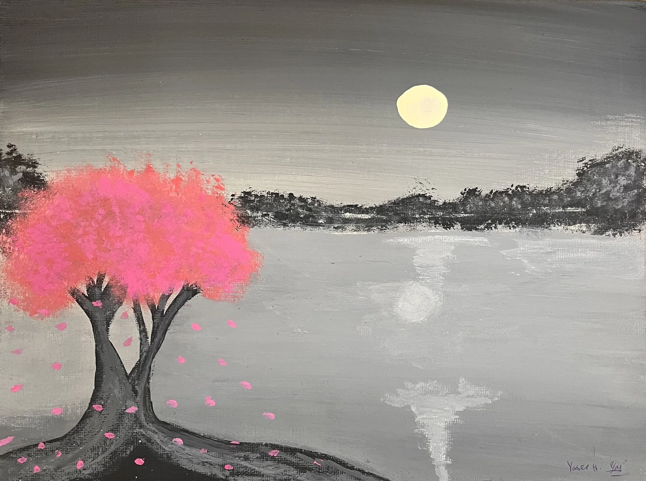
The Gray Day
Acrylic Paint on Canvas
23cm x 30cm
This painting was inspired by Anna Barnhart’s “Pink Blossom Tree”. During sunset, the trees glow against the darkening sky, which is something I wanted to include. I chose a gray-and-white background to make the pink blossoms stand out and create a calm and quiet atmosphere. The reflection of the moon adds depth to the scene. To give the moon a more natural shape, I dipped my finger in cream acrylic and placed it on the canvas. For the trees, I used a small precision brush to paint the leaves.
-
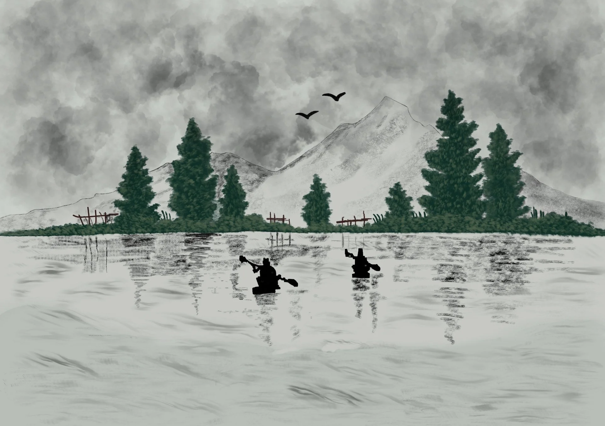
Life in Nature
Digital Art on Procreate
22cm x 36 cm
This piece was inspired by my visit to the Yosemite National Park, where I was drawn to the peaceful atmosphere of nature. I wanted to capture the stillness of a cloudy day using a muted gray background to enhance the contrast between the dark silhouettes and the deep green trees. The wooden gates add a rustic feel to the artwork, and makes the artwork more interesting. On procreate, I used digital artist crayons, soft pastels, and sketching pencils to create a textured, natural look.
-
Himalayan Spring
Acrylic on Canvas
20cm x 25cm
Inspired by the Himalayas, this painting captures the serene beauty of an untouched landscape. The vibrant greens express the liveliness of spring, while the deep blue of the water contrasts with the crisp white highlights on the mountains, showing the region’s year-round climate. The subtle black shadows add depth, which makes the scene feel more natural. Every element works together to create a peaceful atmosphere, capturing the essence of a place where nature remains pure and undisturbed.
-
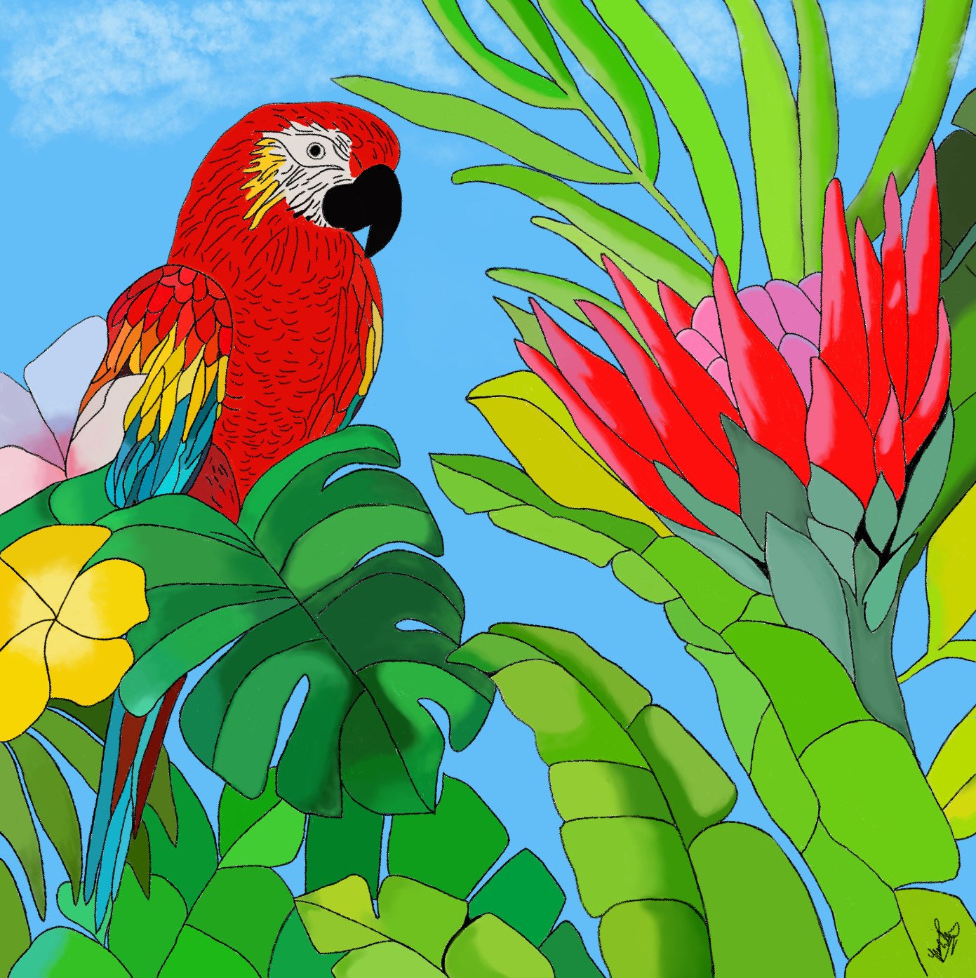
Life of a Bird in Paradise
Digital Artwork on Procreate
28cm x 22 cm
This digital artwork was inspired by Henri Rousseau’s “Toucan Art”, a colorful painting of a toucan. The different types of leaves and flowers with different colors in the Toucan Art inspired me to create a very bright and multicolored digital art, which contains many types of leaves with different colors and also different flowers with different colors. The sky is colored blue in order to show the summer vibes of the artwork, while also adding a positive and peaceful feeling to it.
-
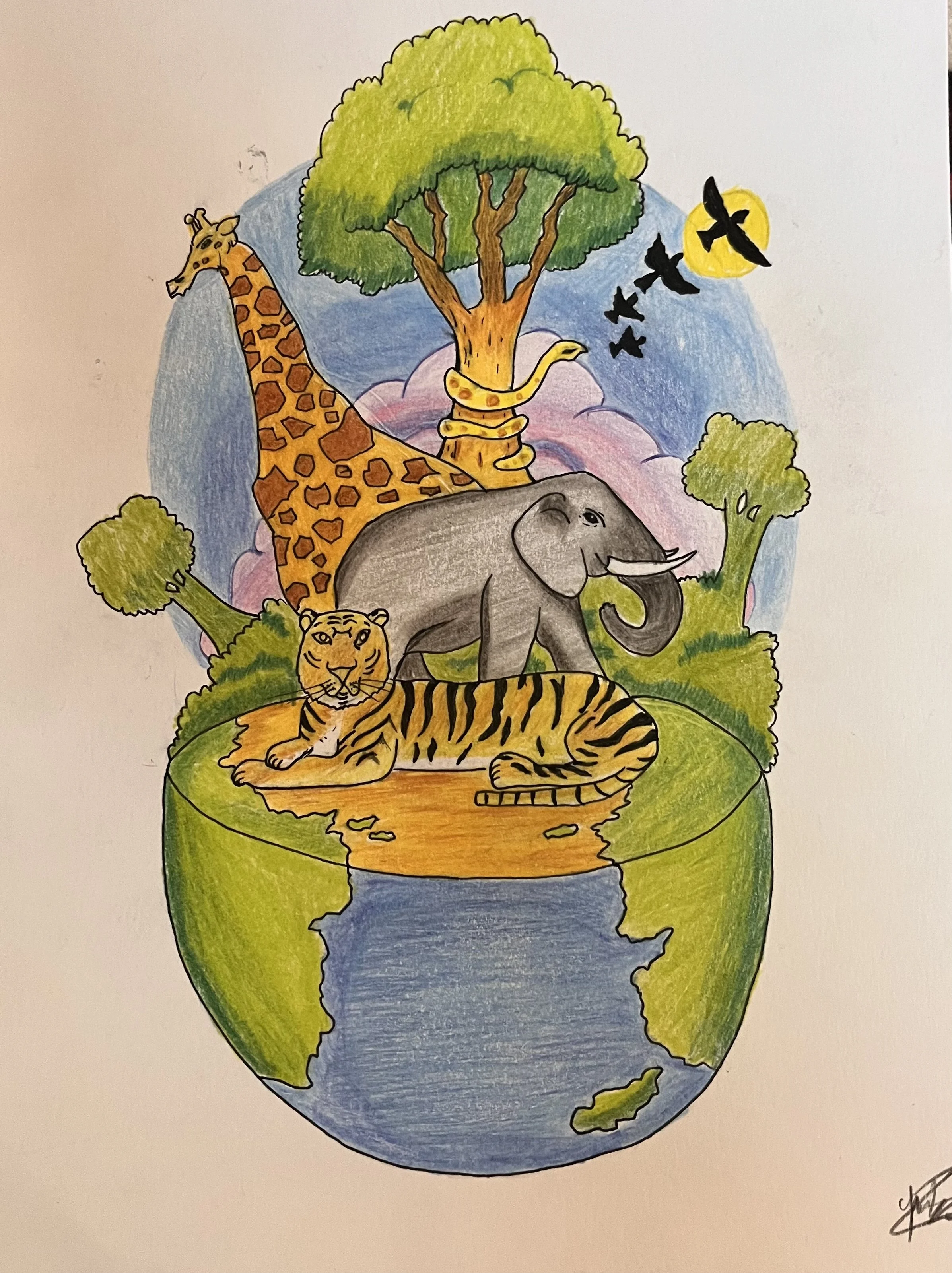
The Kingdom of United Animals
Colored Pencil on Paper
23 cm x 30 cm
This artwork was inspired by the artwork “The Peaceable Kingdom” by Edward Hicks. Hicks’s placement of different animals together on a piece of land inspired me to create an artwork portraying all animals on a small Earth together. My intention of using vibrant colors was to give an overall positive feeling to the artwork. The use of the spherical shape for Earth makes the artwork unique and also shows my intention of portraying animal unity by placing all animals on a small Earth.
-
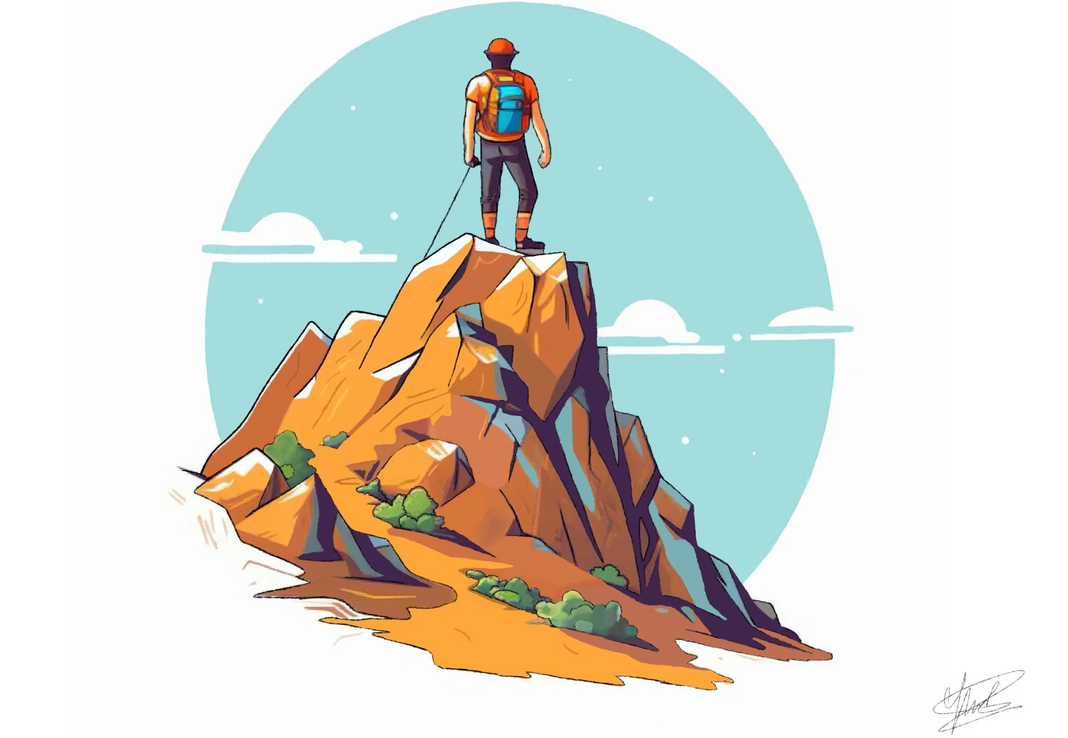
A Free Person's Choice
Digital artwork on Procreate
22 cm x 36 cm
This artwork was inspired by Caspar Friedrich's “Wanderer Above the Sea of Fog”. The artwork’s bright colors give it a sense of freedom and happiness to it. The use of different shades of colors gives it a sense of realism and depth. The use of red and blue separates the person standing on top of the mountain with the rest of the artwork, shifting the main focus of the viewer towards the person. The use of blue and white create a contrast between sky and the clouds, making it more realistic.
-
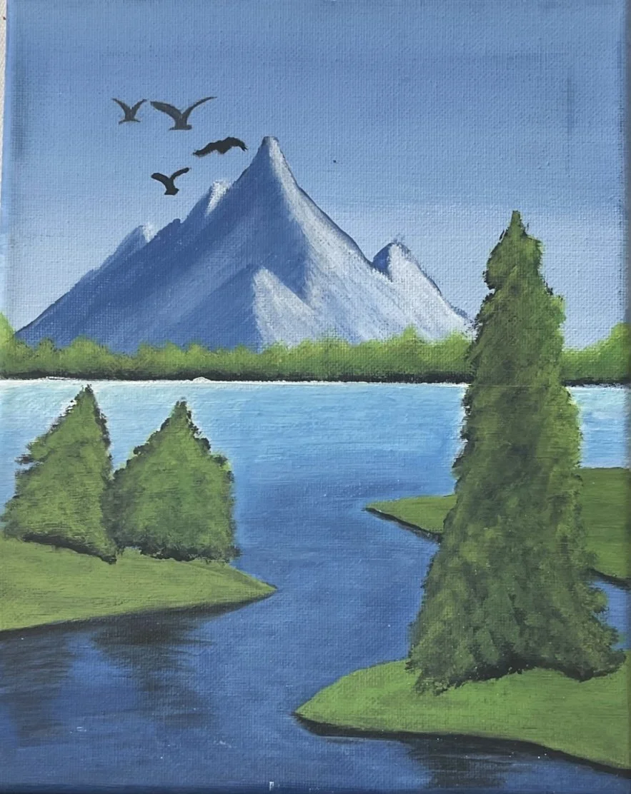
Flow of River
Digital Artwork on procreate
22 cm x 36 cm
I was inspired by Eyvind Earle’s “A Summer Day”, a beautiful painting that he created in 1997. I was inspired by the vibrant colors of the trees, which are also shown in my artwork. Earle’s colors are darker, so I chose brighter colors for the details on the trees and water. The use of dark and light green gives the greenery a sense of realism. The use of light and dark blue in the river resemble realistic water flow, and the different brown colors on the trees add a sense of depth to the scene.
-
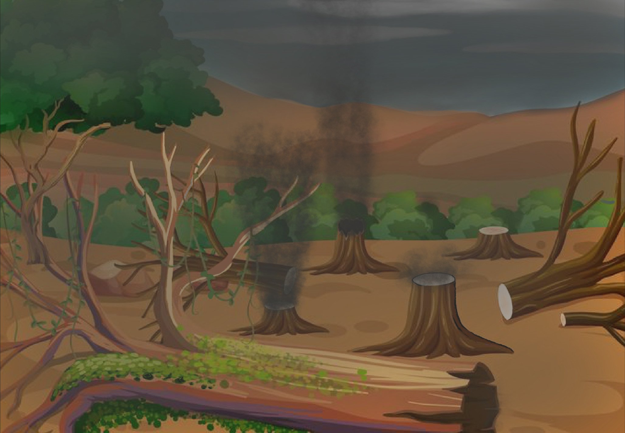
Nature's dead
Digital on Procreate
22 cm x 36 cm
I was inspired by Anselm Kiefer’s ”Fuel Rods”, a painting depicting a burned forest. Like my inspiration, I used dark colors to resemble the theme of deforestation. The different versions of brown and green create a sense of realism, resembling shadow and depth. The use of darker colors for the sky express the sad theme of the artwork, and the use of smoke makes the cut-down trees appear more realistic. This artwork is a warning to people about the destruction of nature if not taken care of.