
Veronika Dobychina
“What is your favorite artwork?”
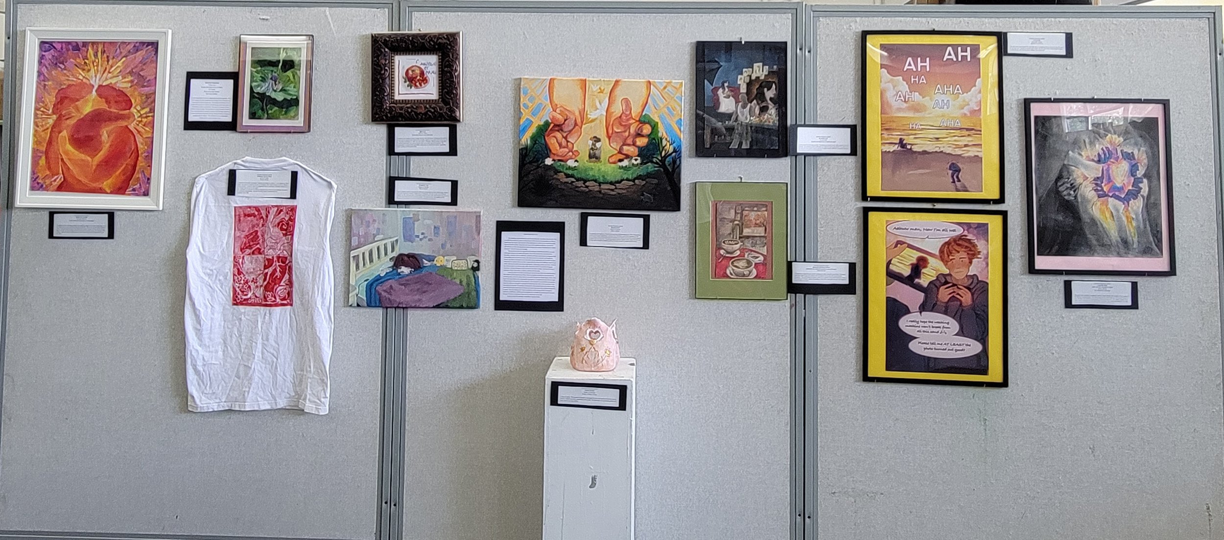
Curatorial Rationale
The exhibition can be viewed from any direction that you, the viewer, have decided. The vision for these works is to curate a varied amount of love experiences throughout our life in a creative way. The intention of this exhibition is to reflect on our experience in life with the love that we find. I hope that each viewer of the exhibition will have a moment of self-reflection on their own experiences while looking at the works to ”find that love actually is all around”-Richard Curtis (Love Actually).
The experiences that were explored in my exhibition varied from familial to romantic with happy moments and sad all together. Some of the themes that can be found are friendship, maternal, and one sided love. I strived to tell these experiences in an engaging style of storytelling and compositional values. The works intend to be relatable and familiar to viewers. My theme is intended to show and reflect human experiences with the different types of loves that we interact with in our lives. I approached the themes from different inspirational outlets, that way the works were diverse experiences. I used songs, poems, and artists. Some of the works are done in an abstract style, while others aim to focus on a specific feeling and experience, and that technique is used to motivate the viewer to think. I used symbolism in a multitude of ways, from colors, to objects, to flowers for the works.
I want the viewer to be able to see the good and see the bad, that’s my works that have a wave of good and bad experiences of love. I have my happiest artworks then paralleled by my saddening ones, so that it’s always there as a reminder that love isn’t always happy. On the other hand I have my saddest works contrasted by my happiest, to commemorate that there is a light of hope and joy in love and that it’s not only sad. I also arranged it in an aesthetic arrangement, where the colors are arranged in a compositional pleasing way, with no over saturation of one color palette on one side. The way that I developed the relationship between the viewer and the artwork by having the experiences be diverse and varied experiences that could have happened to anyone. The main feelings that I want my audience to feel during and after viewing my exhibition is fulfillment. Fulfillment of seeing that love is actually all around us and it isn’t just one type of love but a multitude of ways that we experience it in our life.
I hope you enjoy the exhibition in whichever way you decide.
Veronika’s Artwork
-
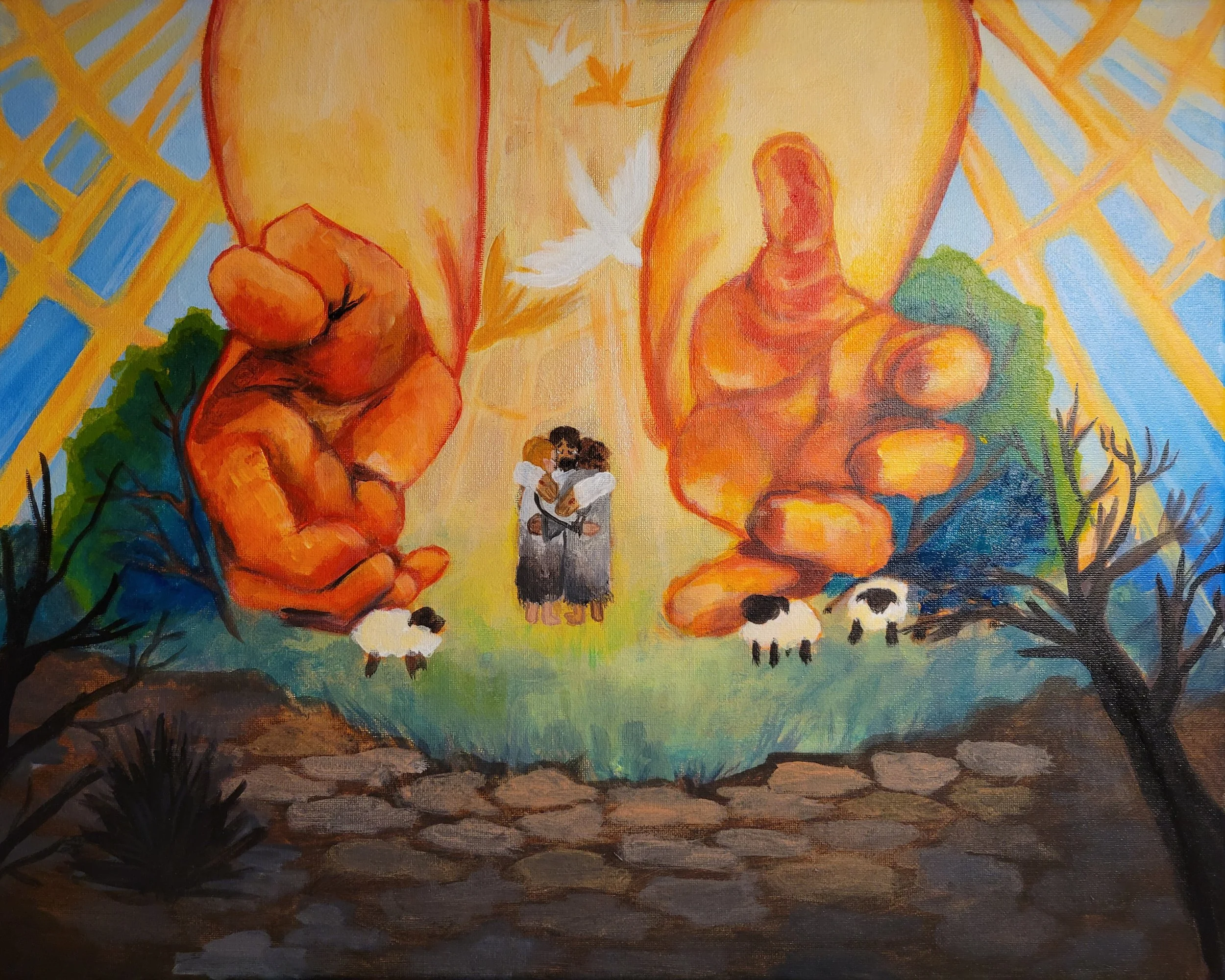
Romans 5:8-11
Acrylic on Canvas
50cm x 40.5cm
This painting was inspired by The Sun that was done by Edvard Munch in 1909. This painting is meant for the Human Experience: Love from God. The Title is part of the inspiration as the verse is telling of the love that God has for humanity even before we love him, and the results of accepting that love from him. The painting depicts God the Fathers hands, Jesus the Son, and the Holy spirit in the forms of birds reaching to the two humans to accept and love them.
-
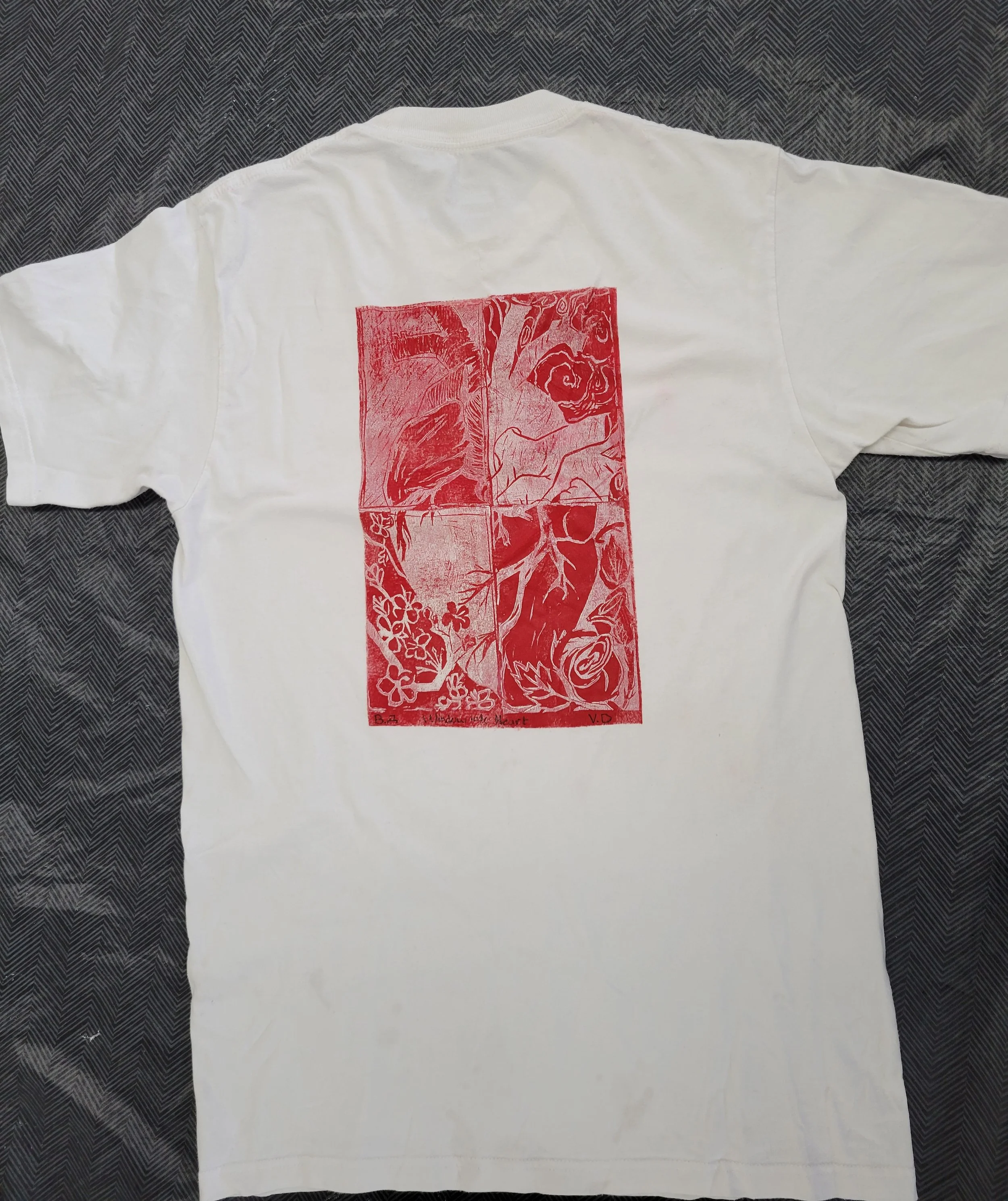
A Window into the Heart
Ink on a T-Shirt
79 cm x 49 cm
A reference to the idiom expression “wearing your heart on a sleeve”. I was inspired by Neisha Yarger, who goes by burgundy blooms on Instagram. She makes linoleum prints for different clothing articles. I chose to make the anatomical heart to symbolize vulnerable feelings and how see-through they are as if in the glass. Each rectangle is a look into the different aspects of love, the rain is the sadness, the winds is the confusing unpredictable, sakura's is young, roses is experienced love.
-
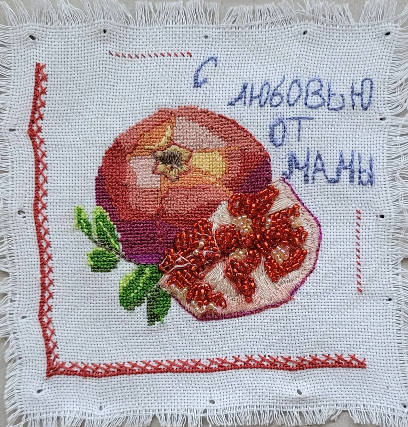
With Love
14.5 cm x 15cm
Embroidery floss on cross stitch cloth.
This artwork was inspired by Mary Cassatt and her work that shows motherhood and motherly love. My work is inspired when moms write on lunch napkins or any paper their loved ones will see. The direct translation is " With Love from Mom" in Russian. Where mothers would often use intricate embroidery as a way to express their love to their kids and husbands. The pomegranate is a symbol of life and fertility, which often is a symbol for women, specifically mothers, as they are the givers of life.
-
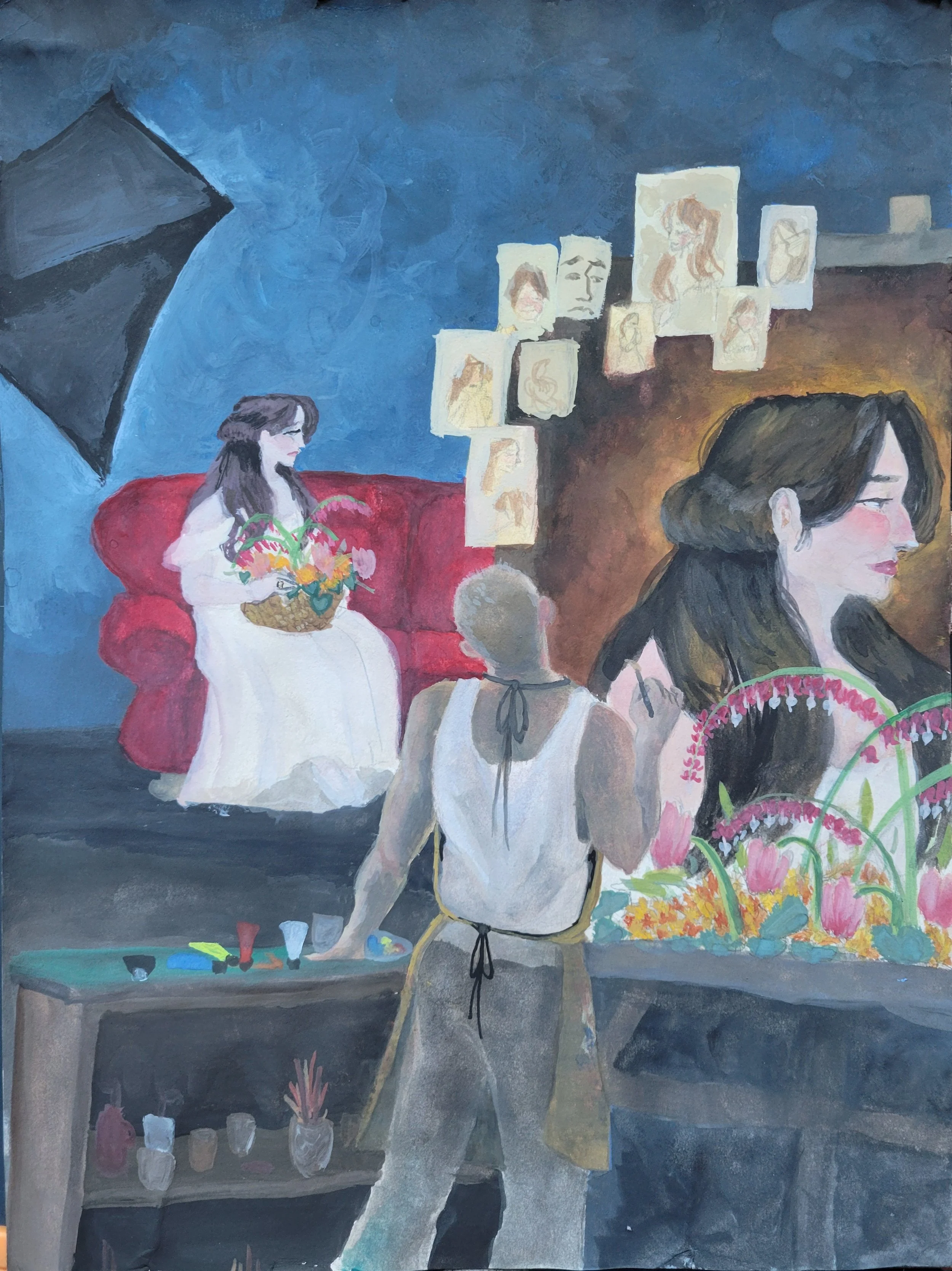
An Artists Love
12 cm x 9 cm
Gouache and Watercolor on Watercolor paper
A blend of hard and Soft edge painting. This painting is inspired by the triple portrait by Norman Rockwell. This painting is made to represent one sided love that is delusional. The artist is in love with their muse but the muse is married to another and the artist isn’t accepting that reality and continues to paint her as if she loves him.
-
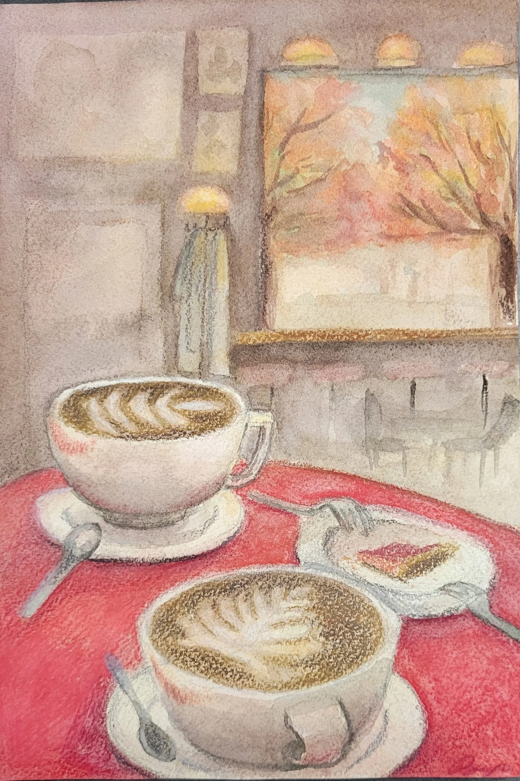
Wanna Go Get Some Coffee?
Watercolor and watercolor pencils on watercolor paper
8.9cm x 6.1 cm
The painting is inspired by the warmth of being at a cafe in fall with a best friend. The use of watercolor helps to give off a dreamy soft atmosphere that is often felt without female friendships. The small details like lipstick stains and a dessert being shared between friends is also important of details. Mainly this painting is done with a soft edge and only hard edge was used to define the details.
-
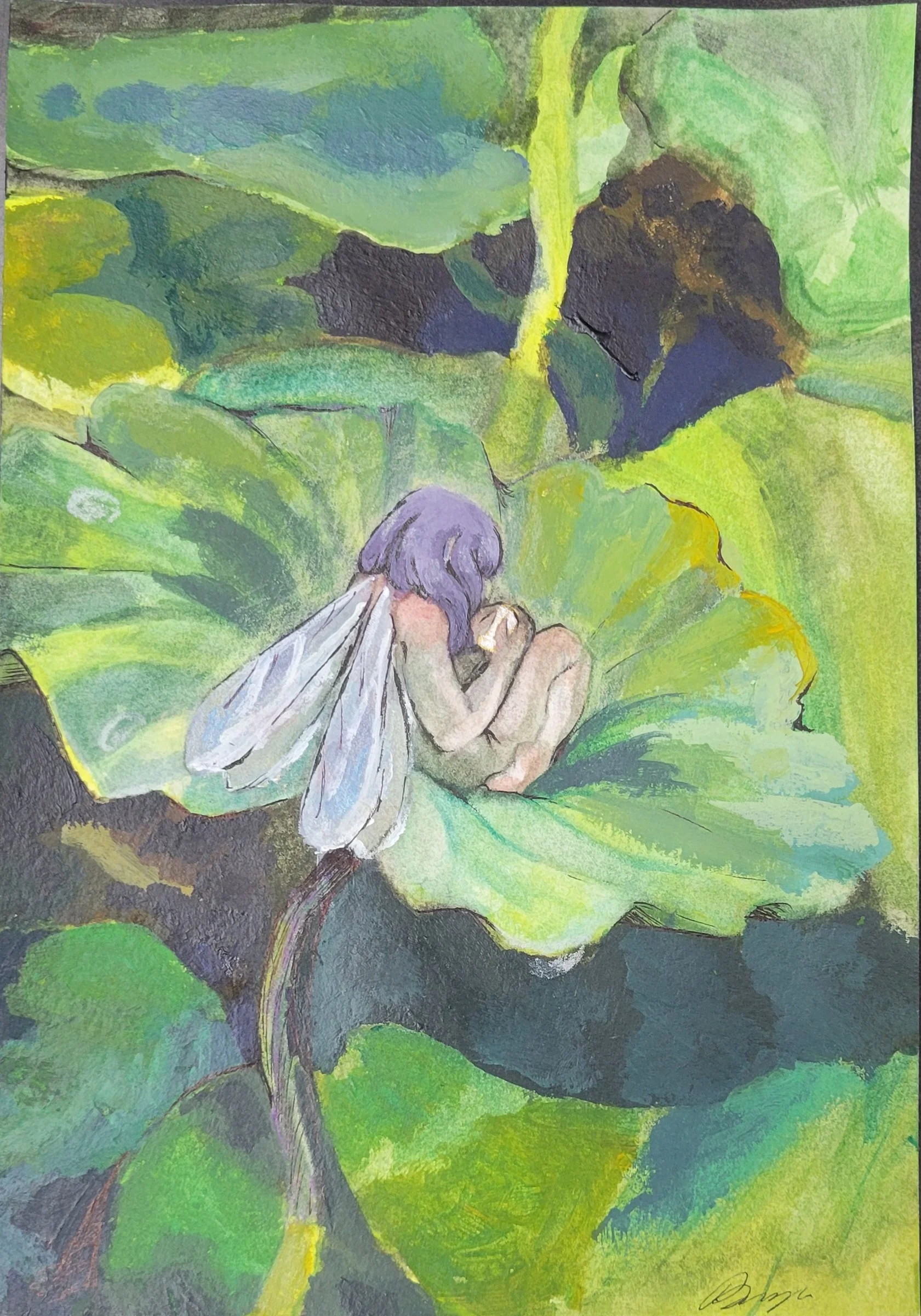
I Miss You
Watercolor and Acrylic on watercolor paper
22.8cm x 15.8cm
I found inspiration in LA at a Japanese botanical garden. There I felt inspired by the seasonal blooming of lotus flowers and how big the lotus leaves are. The leaves reminded me of comfy hammocks on which a small being could rest upon. An illustration with a small fairy. The style to convey is from children's fairy books. It was going to represent melancholic-nostalgic love. This love can be found in romantic relationships and familia, the act of missing someone is a sign that you loved them.
-
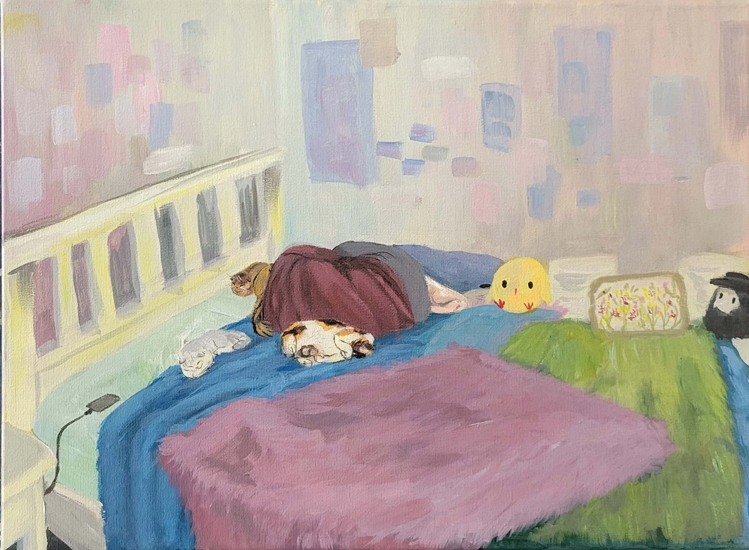
I'll Wait For You
Acrylic on Canvas
40 cm x 30 cm
This is a painting meant to express the silent and unwavering love that is felt through owning a pet. It was inspired by Amelia, or @arozear on Instagram. Her use of color and brushwork inspired me. My main goal was to accurately portray my three cats, what service they do for me, and how much they love me even at my lowest. The neutral-toned color palette and the off-balance composition are used to ensure the off feeling of loneliness.
-
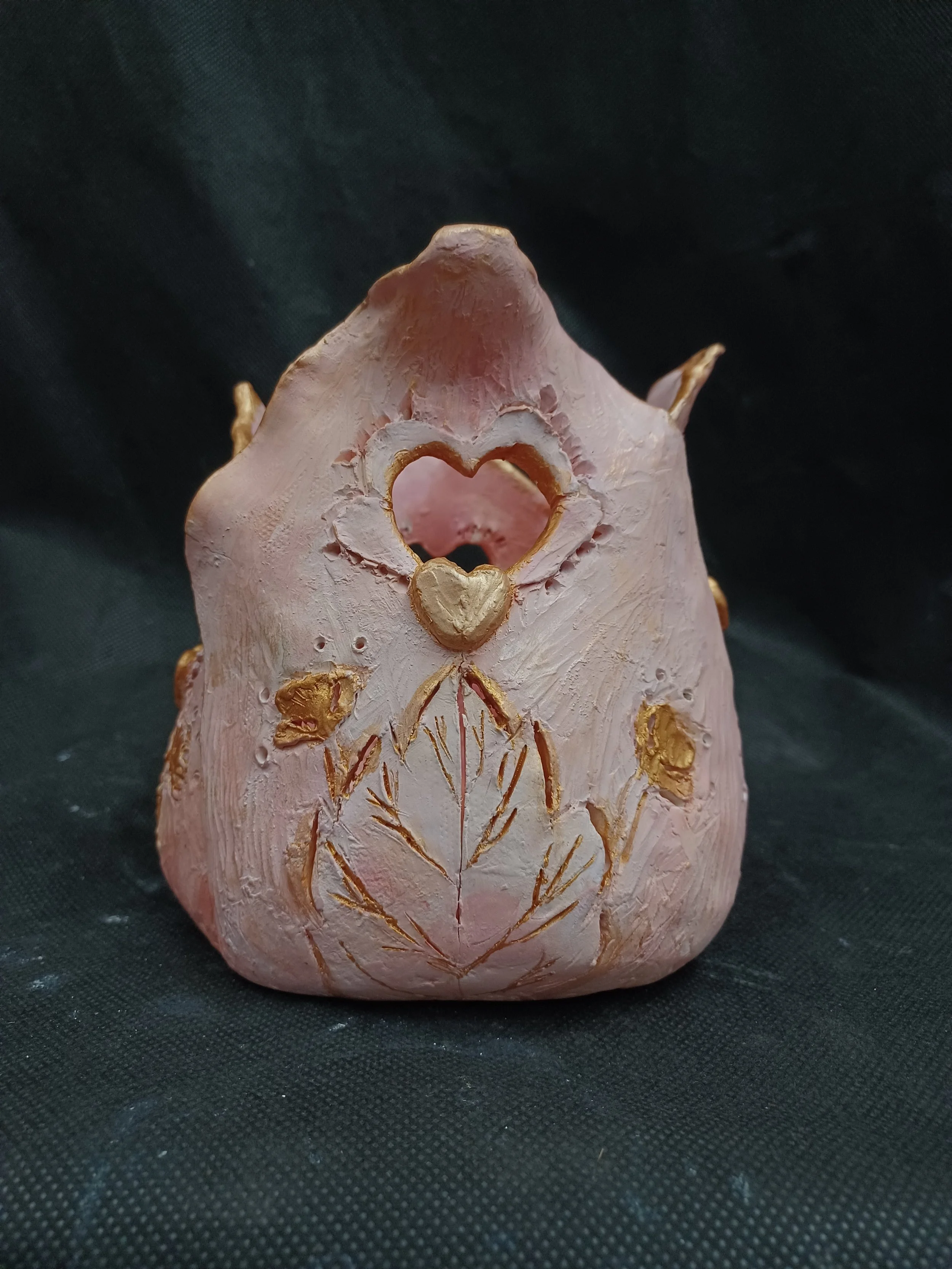
Hearts of Gold
Acrylic on Ceramic
14 cm x 15.5cm x 15 cm
A play on words. This sculpture is meant to represent the pure and innocent love that can be found in children and their perspective of the world. The tulip form is to symbolize perfect and deep love for any type of love.
-
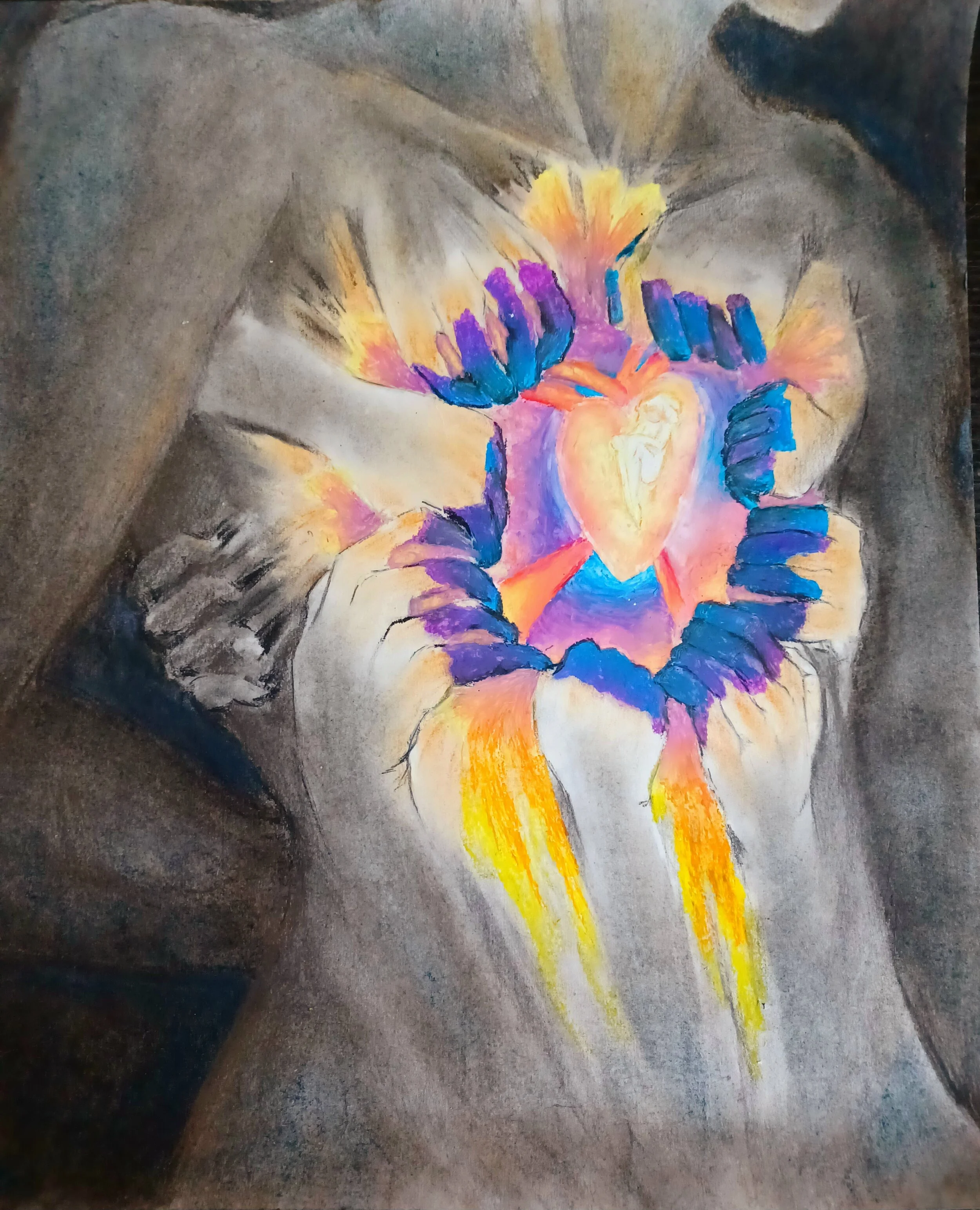
Leave My Heart
Chalk, charcoal, oil pastels on paper
33 cm x 38 cm
This piece was inspired by a sculpture made by David Altmejd. My rendition of his sculpture is the feeling of unwanted love. The need to get rid of it, while it fills you with joy and warmth in your sad dark cold world but knowing that nothing will come of it. The organic shapes of the warm colours escaping from the heart where the person has nested themselves in but, they aren’t supposed to be there. So you claw at oneself to get them out.
-
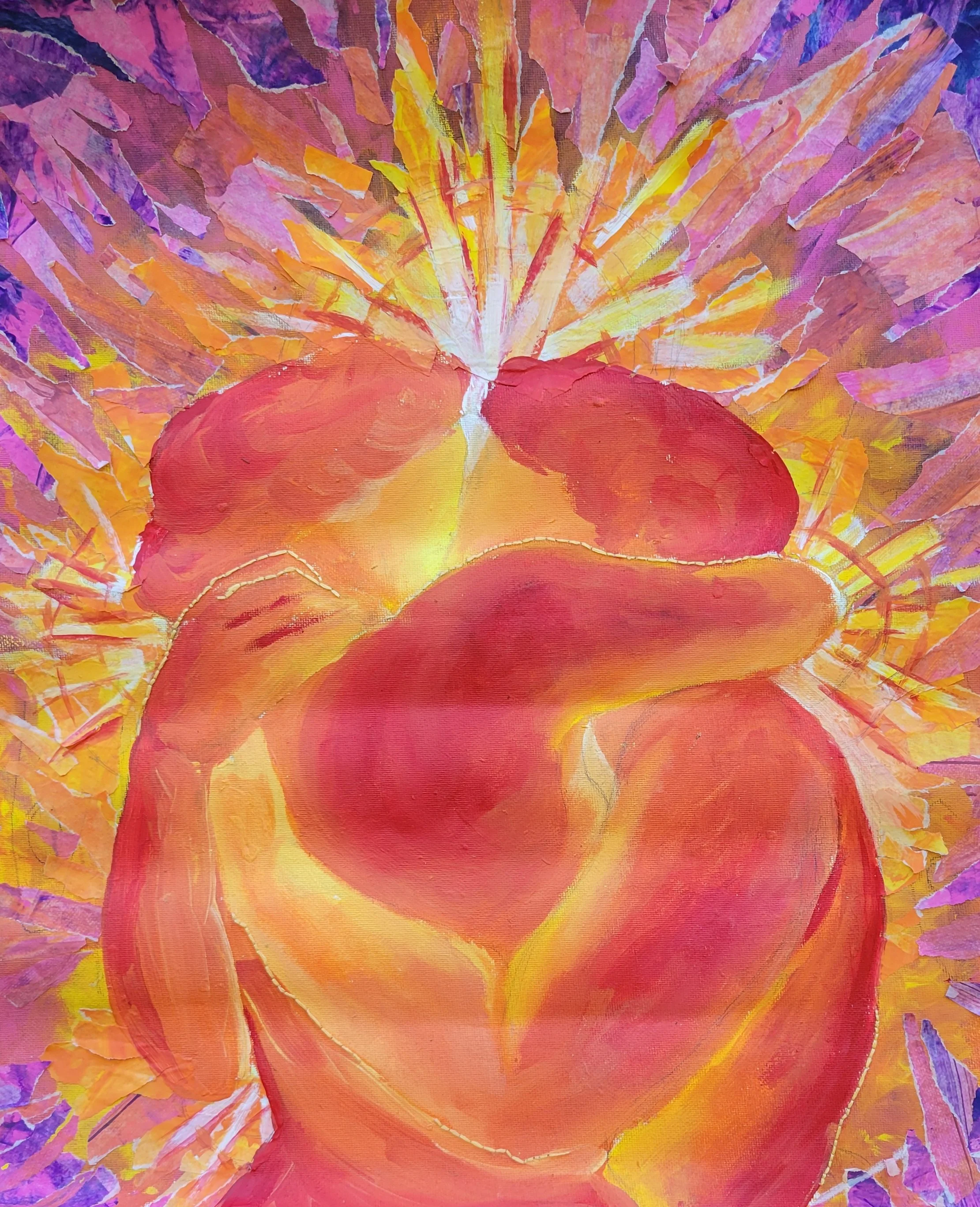
Tell Me You Love Me
45.72cm x 38.1cm
Acrylic, thread, and Deli paper on canvas paper
It's meant to be the intoxicating feeling of the beginning stages of a romantic relationship, where the lightest touch of skin feels like a firework of emotions. Reason for non-descriptive figures is a way of representing this stage of the relationship it doesn't matter how they look as long as they can be felt. The use of bright colors to convey the intoxicated feeling, the adrenalin of the moment, heat map style is to depict that one touch is like being burst into flames from touch from them.
-
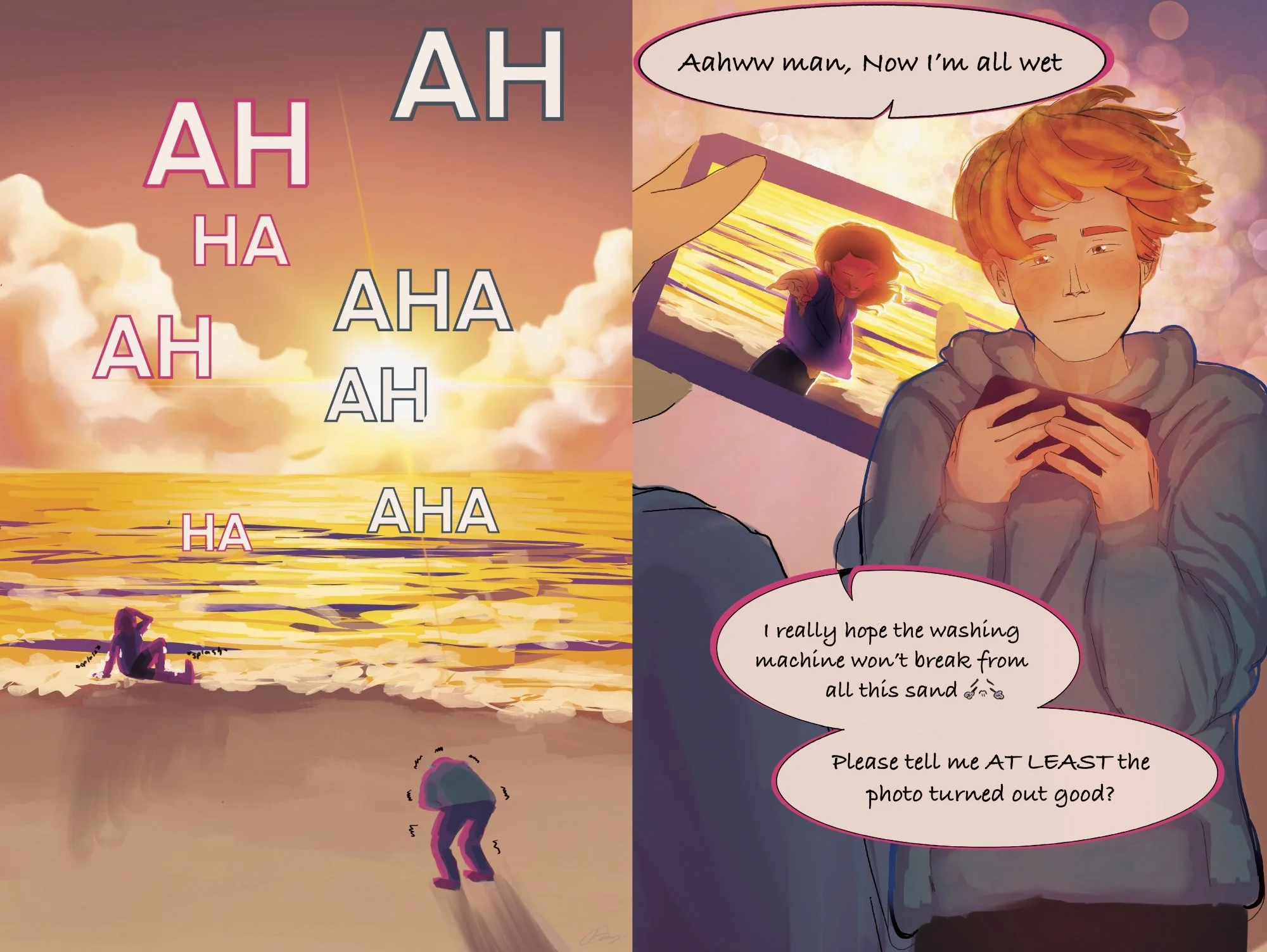
I Found Her
Procreate, Printed
30.48 cm X 45.72 cm
This mini-comic was inspired from the trope idea of accepting that you truly love only this person for who they are. I wanted to express that moment with this short story of two friends hanging out and the guy who took the picture falling in love at the end.