A peek into the artist’s mind…
Curatorial Rational
During IB Art, I explored making artworks that are surrounded by the negatives and positives of our world's wildlife. I chose the theme of wildlife, considering all of the harm that humans have caused to both animal life and the environment. I also chose it to express and showcase feelings using the beautiful remedies that our world has to give. I gave my pieces symbolism to tell a story that the audience is writing — how certain actions they take have affected, and continue to affect, the world in negative ways. To balance this, I created pieces that were not only dedicated to the gloomy side of things but also focused on the blessings of our wildlife. Each of my artworks showcases different emotions, beauties, and problems.
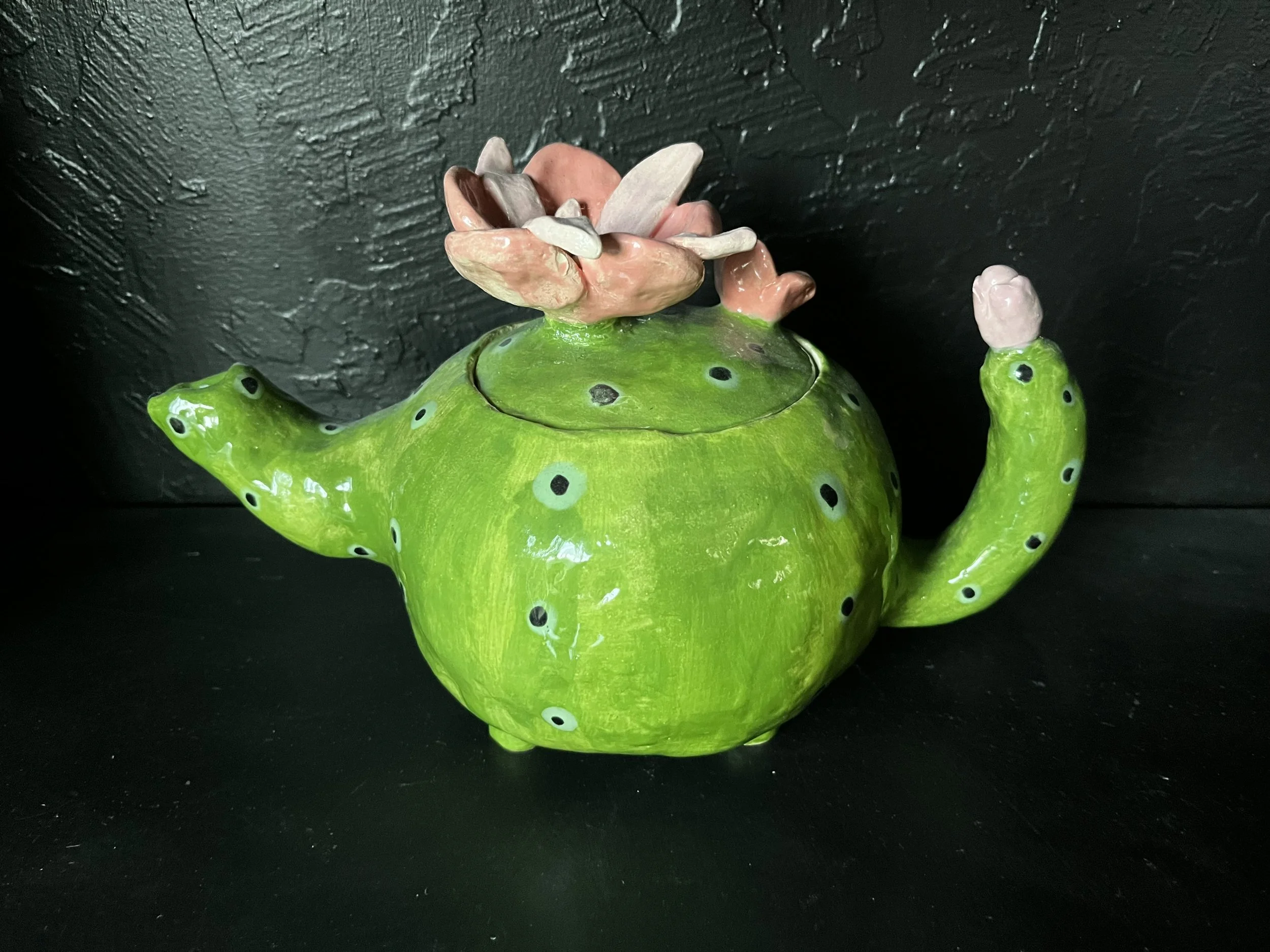
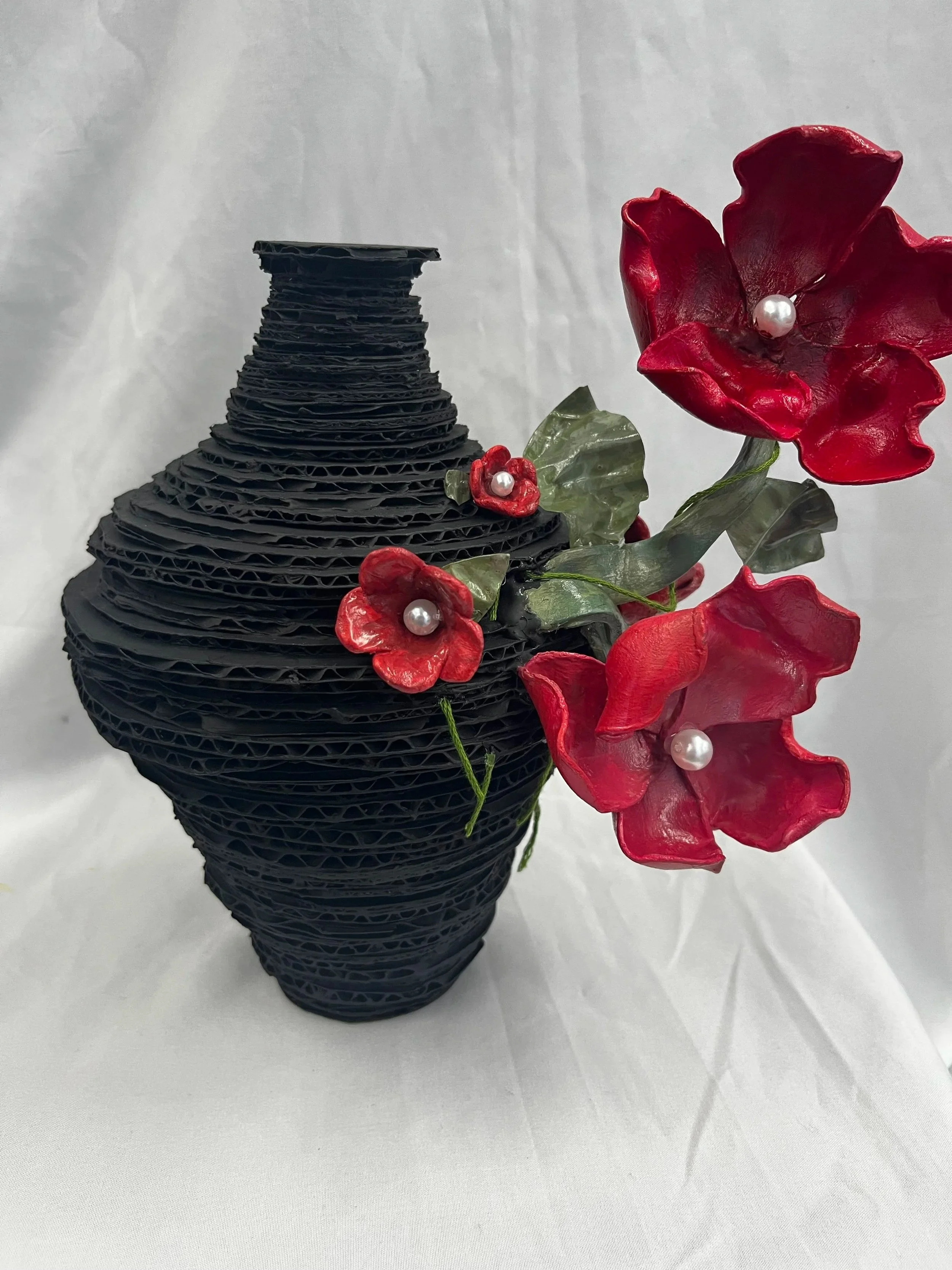
For example, in “Toxic Relationship,” I used color to express the feeling of being stuck, which is demonstrated through the flowers branching away from the vase. The black vase represents evil and darkness, whereas red represents strength and confidence. In my piece “Spirals of Renewal,” I was inspired by the season of spring. I used a pinkish-purple glaze combined with a blue glaze to represent blooming flowers, clear skies, and arrival — collectively symbolizing a fresh start. I used a dragonfly to emphasize the meaning of the piece because dragonflies represent renewal and transformation. Lastly, in my piece “Displaced,” I sculpted a four-bowl structure with a fish jumping into the bottom bowl. The matte, earthy glazes attract attention toward the emphasis of the piece — the goldfish. This piece represents animals being taken away from their homes and placed somewhere else.
I want my pieces to make people question what they have done or what actions they are currently taking that may destroy or degrade our world. I also want the audience to question whether they are doing any good for the environment or if there are actions they could take to improve it. In my artworks, I mainly used mixed media because the world is made up of many materials and gases, and I wanted to represent that complexity in my pieces. Some of my pieces are only ceramic, a medium I have dedicated time to learning and experiencing by working with raw materials from our environment.
I selected these nine artworks because they demonstrate and provide the most powerful statements to share my ideas and opinions in an intricate way. With the order and sequence of the display, I wanted the exhibition to feel unified and balanced in terms of size and color. The main centerpiece of my show is “Displaced,” with the rest of the pieces surrounding it. The pieces “Spirals of Renewal” and “Lone Octopus” will be placed on the sides of “Displaced.” These pieces are placed there because they are both ceramic and are opposite in positive and negative meaning. Next to those will be “Toxic Relationship” and “Flourishing Dragons.” These two pieces are opposite from each other because they are both based on feelings and emotions, as well as similarities in materials and aesthetics. The pieces “Azura” and “Fluorescent Teapot” are among the last two pieces, as they both have similar symbolism. Lastly, “Destruction” and “LoveBug” will be hung above the other pieces, though not centered, to leave room for my name. All of the pieces are arranged in this way to maintain unity in color, shape, and size.
Compared to my junior year works, my senior year pieces demonstrate stronger conceptual cohesion, more intentional symbolism, increased technical control with glazing and structural integrity, and a deepening inquiry through more advanced subjects and artworks that require a high level of patience.
Gallery
-
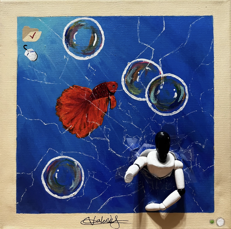
![This piece was inspired by old 2000’s technology compared to what we have now. With the message of modern technology being used as a destructive tool to our minds, while the modern AI robot breaks through the screen to captivate you into using and al]()
Destructive Valerie Sanders Mixed media 30cm x 30cm x 30 cm 2025
This piece was inspired by old 2000’s technology compared to what we have now. With the message of modern technology being used as a destructive tool to our minds, while the modern AI robot breaks through the screen to captivate you into using and alter your mind into using AI. Destructive Valerie Sanders Mixed media 30cm x 30cm x 30 cm 2025
-
![]()
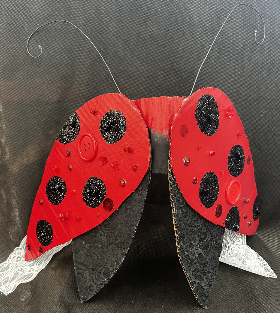
LoveBug Valerie Sanders Mixed Media 107 cm L, 48 cm H 2025
This work was inspired by resin tops. What inspired me was how the tops were fitted as they were, contoured to the body. The ladybug winds represent a chest plate that symbolizes protection and growth.
-
![]()
Fluorescent Teapot Valerie Sanders Ceramic Size 2025
This vessel was inspired by a bloomed cactus, and I recreated that by hand sculpting a teapot with bloomed flowers in different stages of the flowering cycle. Greens and pinks were used to give the teapot contrast.
-
![]()
Toxic Relationship Valerie Sanders Mixed media 9.6 cm H x 12.4 cm L x 22.7 cm 2025
In this artwork of mine, I was inspired by Franz Biscoff with his water lily vase and the capability of expressing a deep emotion through imagery, so I created a piece expressing a toxic relationship with flowers and a vase. Expressing feelings is a hard skill, but you can express yourself through more than just words.
-
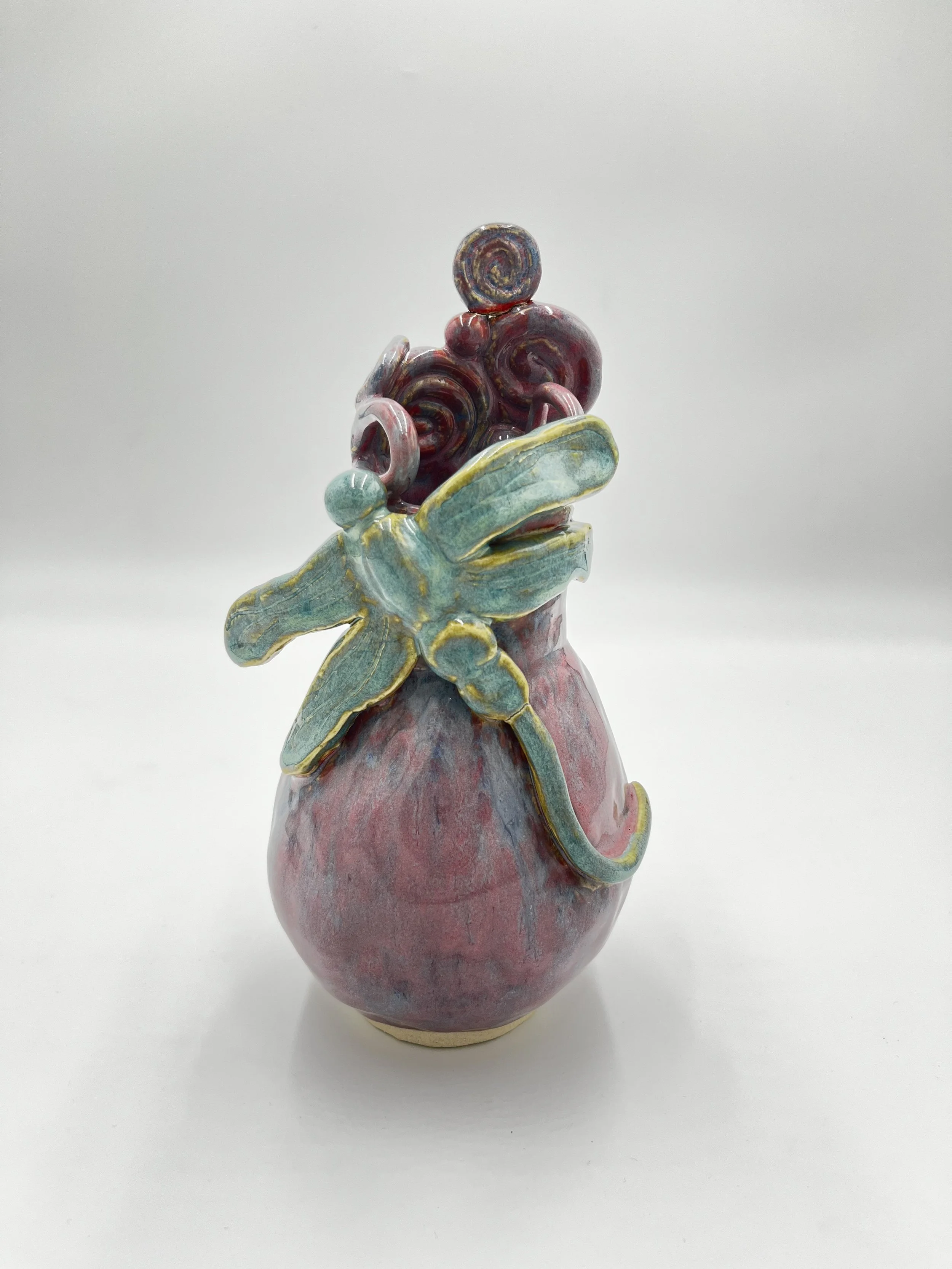
![]()
Spirals of Renewal Valerie Sanders Ceramic 24 cm H x 10 cm L x 10 cm W 2025
This piece was inspired by spring, one of my favorite seasons. I used pink, purple, and blue for the vase with spirals and shapes for unity. The dragonfly represents renewal, and I used a blue-green glaze for it to stand out, but also come together with the piece.
-
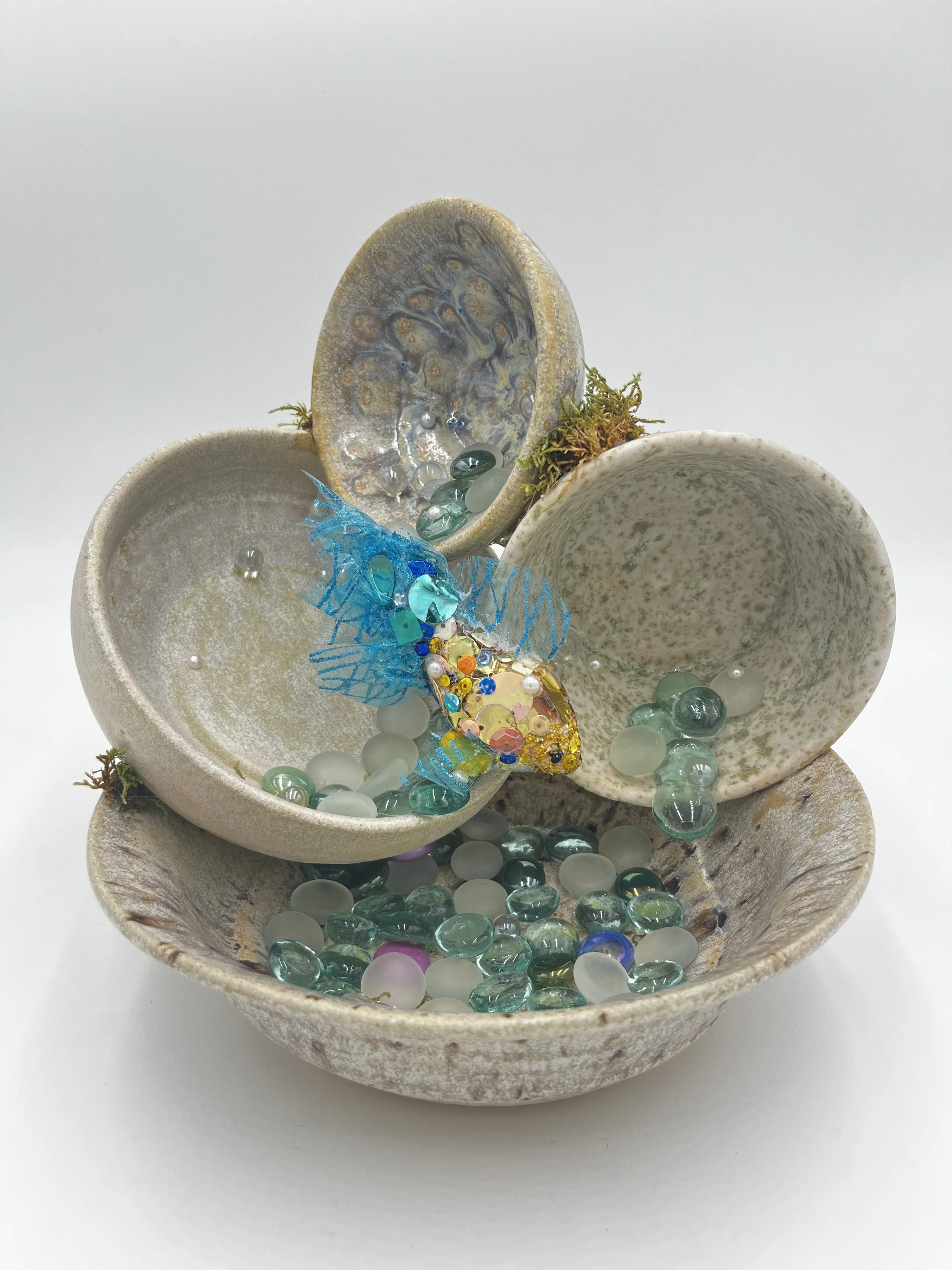
![]()
Displaced Valerie Sanders Mixed Media 23.5 cm H x 24 cm L x 18cm W 2026
For this project, I sculpted a 4 bowl sculpture with a fish jumping out into the bottom bowl. The matte earthy glazes are used to attract your attention towards the fish and the glass that replicates water. This piece represents Displacement as well as removal.
-
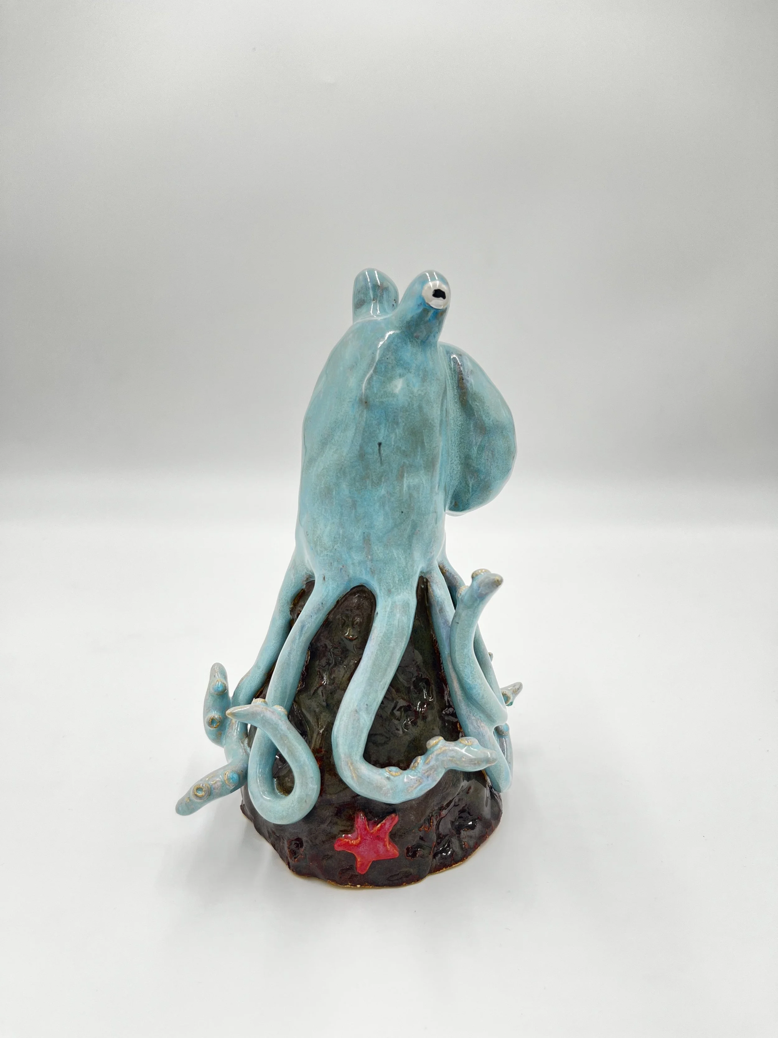
![]()
Lone Octopus Valerie Sanders Ceramic 24cm x 12.7cm x 12.7cm 2025
For my project "Lone Octopus" I was inspired by the population decline of octopuses due to habitat loss and overfishing. I represented the habitat loss with this piece by creating a blue octopus that doesn't fit or camouflage with the rock that it is placed on. The red starfish symbolizes danger and a reminder of something painful that keeps returning, which would be overfishing. While this piece is beautiful, it reflects the harsh aspects of our world.
-
![]()
Flourished Dragons Valerie Sanders Mixed Media 51.5 cm H x 19 cm L 11.5 cm W 2025
For this project, I was inspired by my own artwork, “Toxic Relationship” which represents feeling stuck in a relationship or situation. This piece, it represents how beauty can survive a hardship and grow to be the best version of itself
-
![]()
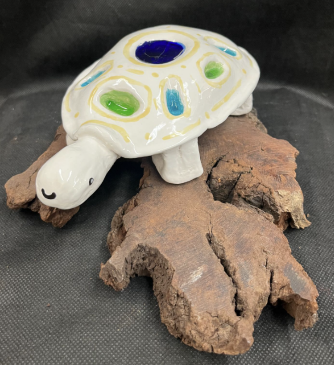
Azura Valerie Sanders Mixed Media 23 cm L x 13 cm W x 6 cm H 2025
With this piece, I created a turtle with glass infused into the shell with various colors of blues and greens, which is sitting on a wooden piece. I created this piece to represent renewal as well as transformation. The title Azura means light and serene, which reflects my piece.