Alina Slobodyanyuk
My body of work is about the ugly side of human psychology, or psychology and humanity. Feelings like loneliness, depression, addiction, and more are represented. I want to take the audience on a survey of negative emotional psychology, and to have them reflect on what my body of work means to them. The artworks convey emotions I have felt or have seen others experience. Each artwork brings up one’s own memory of a psychologically difficult experience. For example, Reflections discusses postpartum depression, but it can symbolize other deeply personal things to the individual. My vision for this body of work is to present a wide range of experiences that hold a universal meaning. I created each artwork with the intention to colorfully convey emotions that we don’t want to face in our lives. Although I created my perceptions of an emotion, the body of work transcends my own meaning as others view art in their own light.
To capture variety in experience, I used a variety of mediums. Although I heavily explored digital art and painting, most of my artworks were mixed media. I did not want to constrain myself to one medium per artwork to acknowledge that psychological states are mixed for everyone. Mixed media pieces allowed for me to depict a broader range of emotions. I used a lot of patterns with text, shapes, etc. in my body of work. I felt that patterns helped clarify the main idea of each artwork. I also used a lot of flowing brushstrokes and experimental paint mixing to symbolize the amorphous and unclear human psyche. Color contrast and focal points were important to me, as behind every psychological emotion is a human. My pieces are all independent of each other, yet form a whole due to their randomness and underlying theme of negativity. My experiences with familial, personal, and researched stories helped create this body of work. I looked for common emotions felt by groups of people regardless of culture or demographic. Although some artworks were more tailored to an audience than others, they were broad enough for the audience to resonate at least one work. I directly used others’ words and stories as an inspiration whenever I worked, making sure to craft the details of human experience to the most accurate extent.
My exhibited artworks are placed randomly, in somewhat of a store layout. This allows for the audience to first examine the artwork most interesting to them, which is probably different from another audience member’s choice. This placement helps the audience find which artwork they intuitively resonate the most with. For example, a person from the former USSR will probably feel compelled to look at Iron Curtain. Then, they “zoom out” to the other pieces, going “window shopping” for the emotion that they feel the next most-connected to. As they observe my body of work, they gain understanding or questions from each unique artwork. This placement method creates a relationship with the artwork and viewer. They feel the most connected to the artwork that caught their attention first before moving on to go “shopping” for other relatable artworks in my body of work. The audience considers the emotional impact each experience had on them as they read the label information, mentally “buying” these artworks as they reflect. As they leave, their psychological experiences will be fresh in their mind. The placement of the artworks supports this statement: no artwork is fighting for attention, they are simply present. This straightforward layout creates no tension between each artwork, there is a clandestine separation between each artwork that is neither hostile nor chaotic. The body of work creates unity in its organized disunity. I want the audience to consider the pieces they feel the most connected to, and apply it to their own lives. I want them to introspect on what unique meaning my artworks have to them. The audience must feel a strong emotion that they relate to in at least one artwork in order to grasp the meaning of psychology and humanity.
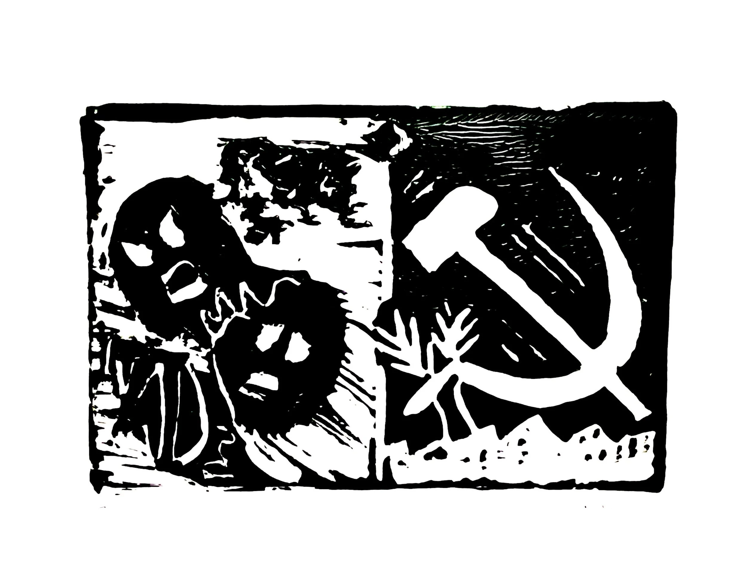
Iron Curtain
Linocut with ink, digital processing
15.24 cm x 15.24 cm
June 2021
Iron Curtain is inspired by Kandinsky’s linocut called The Mirror. Iron Curtain is dominated by the color black like in The Mirror. Political elements of Communism combine with human agony, but also signs of prosperity. I admire how Kandinsky used shadows to create mystery around the linocut, particularly in the faces. The shadows coalesce here to create a gloomy atmosphere reminiscent of Soviet Russia. Iron Curtain portrays not only the powerful hammer and sickle, but also its human toll.
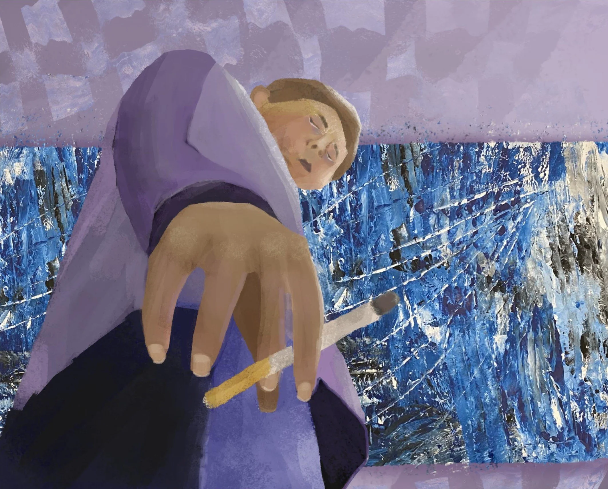
Reverse Logic
Mixed media acrylic paint on paper and Krita 4.4.3
2480 x 2000 px
September 2021
My inspiration was Galen Gibson-Cornell’s mixed media piece, ALICIA KEYS. I was inspired by his integration of geometric checkers into a woman’s face. It looked chaotic but also harmonious. I intended to portray cigarette smoking’s effect on the body by drawing a stylized figure with an unhealthy facial glow. It was not an overt attack on smoking, but rather a subtle message that juxtaposes the “fun” background, as many start smoking because they think it’s fun, with the unhealthy figure.
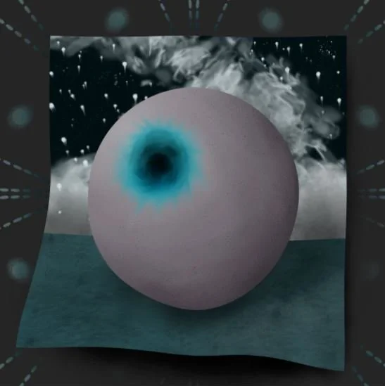
Gooby Bol
Krita v.4.3.0
25.4 cm x 25.4 cm
2021
Gooby Bol was inspired by Wayne Thiebaud’s Jolly Cones. I liked the simplistic composition and the representation of a round, surreal object. I drew a surreal image with dashes of blue on it to mirror the conflicting tone of Jolly Cones. I wanted to depict a strange, otherworldly feeling that was not-quite-right through atypical objects.
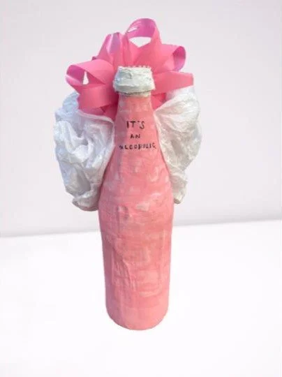
No Love for Baby Alcoholics
Mixed media ink, acrylic paint on paper mache, and found objects
17.145 x 12.7 x 18.415 cm
November 2021
My inspiration was Renee Parker’s Wave Vessel #3. I was inspired by her use of paper mache technique in which she used a real bottle as a mold. I was also inspired by her use of contrasting elements and color schemes to create a simple yet impactful design. No Love for Baby Alcoholics intends to critique how alcoholism is normalized, despite having negative consequences both socially and physically, like in the case of alcohol consumption during pregnancy.
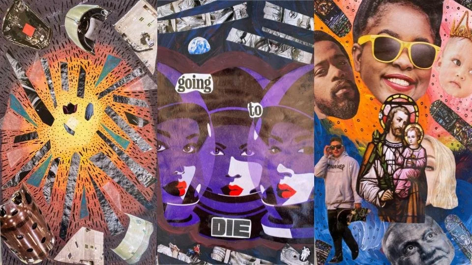
Our Behavior
January 2022
Mixed media collage, tissue paper, and acrylic paint
45.72 cm x 15.24 cm
My inspiration was Egon Tschirch’s Song of Songs, No. 11, which had rays of tempera paint coming out of the sky. I was inspired by his medium of paint and his lines leading to a focal point, which I used in ⅔ of my triptych collages. Our Behavior shows the beliefs of creationism and the big bang, how the former is more emotional, while the latter is objective. The center triptych blends both ideologies, using space as a metaphor for the unknown, as well as death’s permanence.
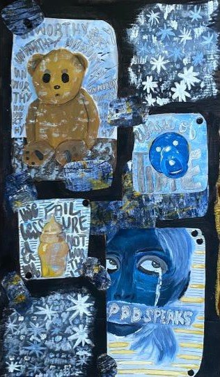
Reflections
Digitally altered mixed media found objects, ink, acrylic paint, and rubber stamping on cardboard
30.3 cm x 50.8 cm
September 2021
My inspiration was Andy Dixon’s painting and oil pastel piece, Our Apartment, which depicted objects to show life details. He also primarily used two colors in his artwork: shades of red/pink and blue. Like Dixon, I mainly used two colors: yellow and blue. I also used a single color for the background: black, and Dixon used many single blocks of color in his artwork. I intended to portray the struggles of severe postpartum depression and its serious nature; sufferers face very dark thoughts.
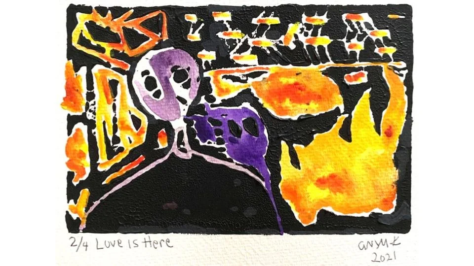
Love is Here
Linocut with ink, acrylic paint, watercolor paint
12.7 cm x 7.62 cm
August 2021
Love is Here is inspired by Jeremy Cunningham's linocut, Saint Ignatius Gives Up the Ghost. Cunningham's linocut was taken from the story of Saint Ignatius, who was brutally executed for practicing Christianity. His artwork depicts both a spiritual and physical death, while the character in Love is Here just “gives up the ghost” spiritually. Love is Here intends to convey the burning energy felt upon experiencing psychological conditions. One condition can be the Freudian psychic death, which contains elements of apathy, understanding, and/or aggravation.
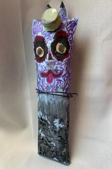
Papa
Paper mache, acrylic paint, markers, wire
6.35 cm x 25.4 cm
May 2021
Papa is inspired by Natalie Paranhos’s cat paper mache. Papa is a twisted take on innocent cats utilizing non-local color schemes and cartoon-like features to make a sinister cat. Utilizing the same physical base and approach to art as Paranhos’s cats, I show that cats are not just happy little animals. Drawing from surrealism, Papa demonstrates that cats can be deadly and symbolically powerful.
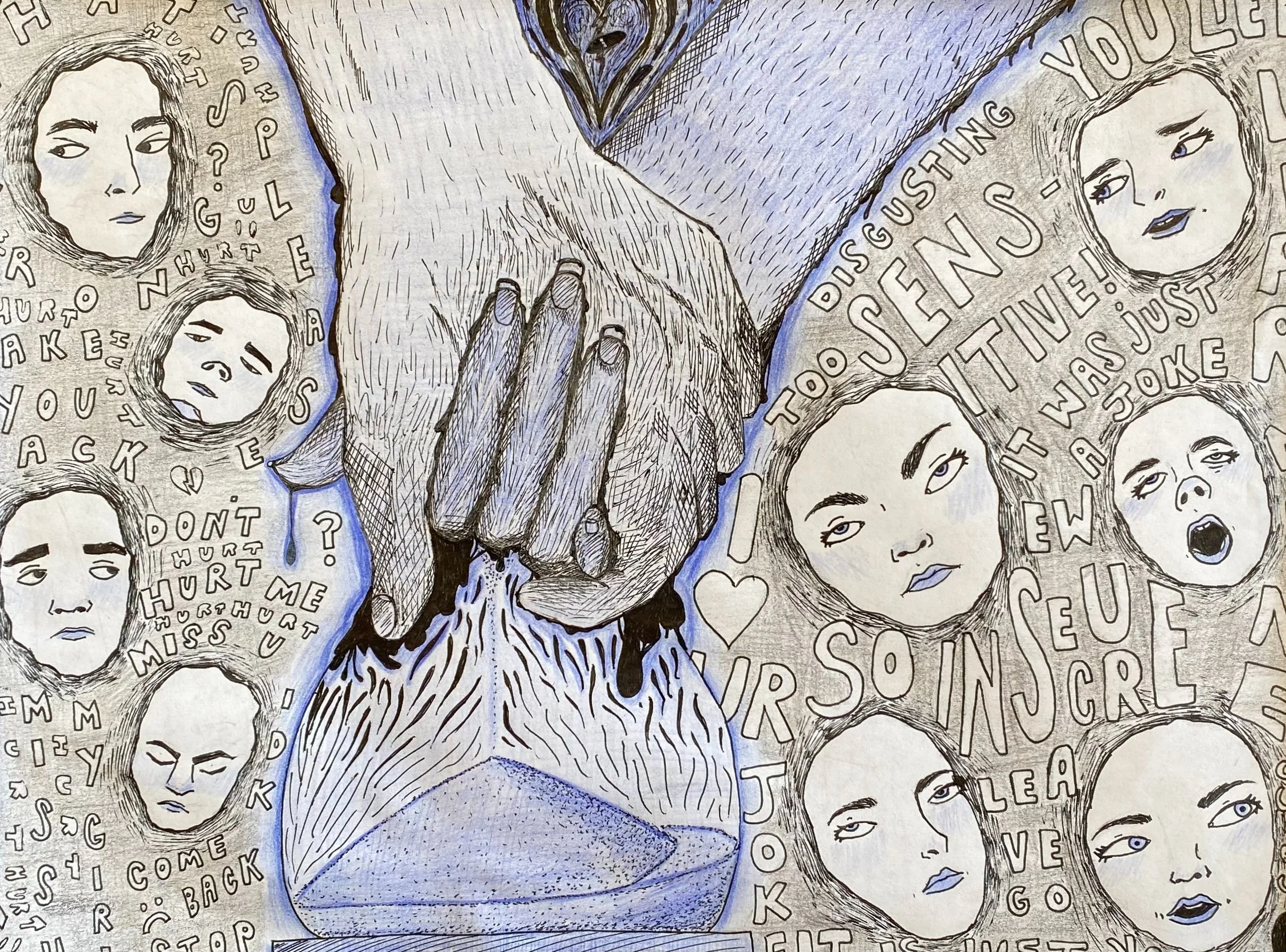
Gaslighting
Mixed media ink and colored pencil on paper
30.48 cm x 22.86 cm
October 2021
My inspiration was Pits’ Guardando Recuerdos. I was inspired by their grotesque imagery to convey the action of saving memories. I was also inspired by their crosshatching technique coupled with the simple, contrasting color scheme. In Gaslighting, I intend to portray how morally wrong gaslighting is by showing how a relationship crumbles and turns “hairy” with manipulation. In this case, a female gaslit a man which is explained in the text surrounding the hands and the hourglass.