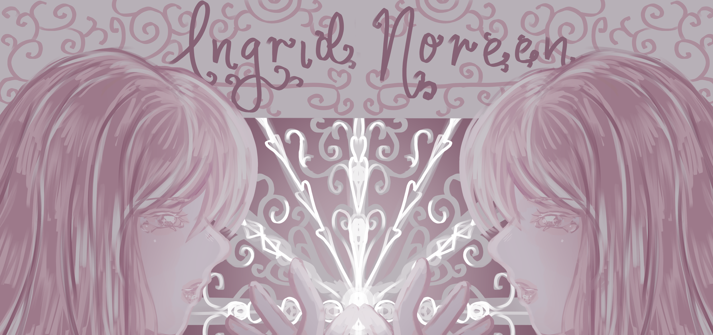
A Peek into the Artist’s Mind…
Curatorial Rationale
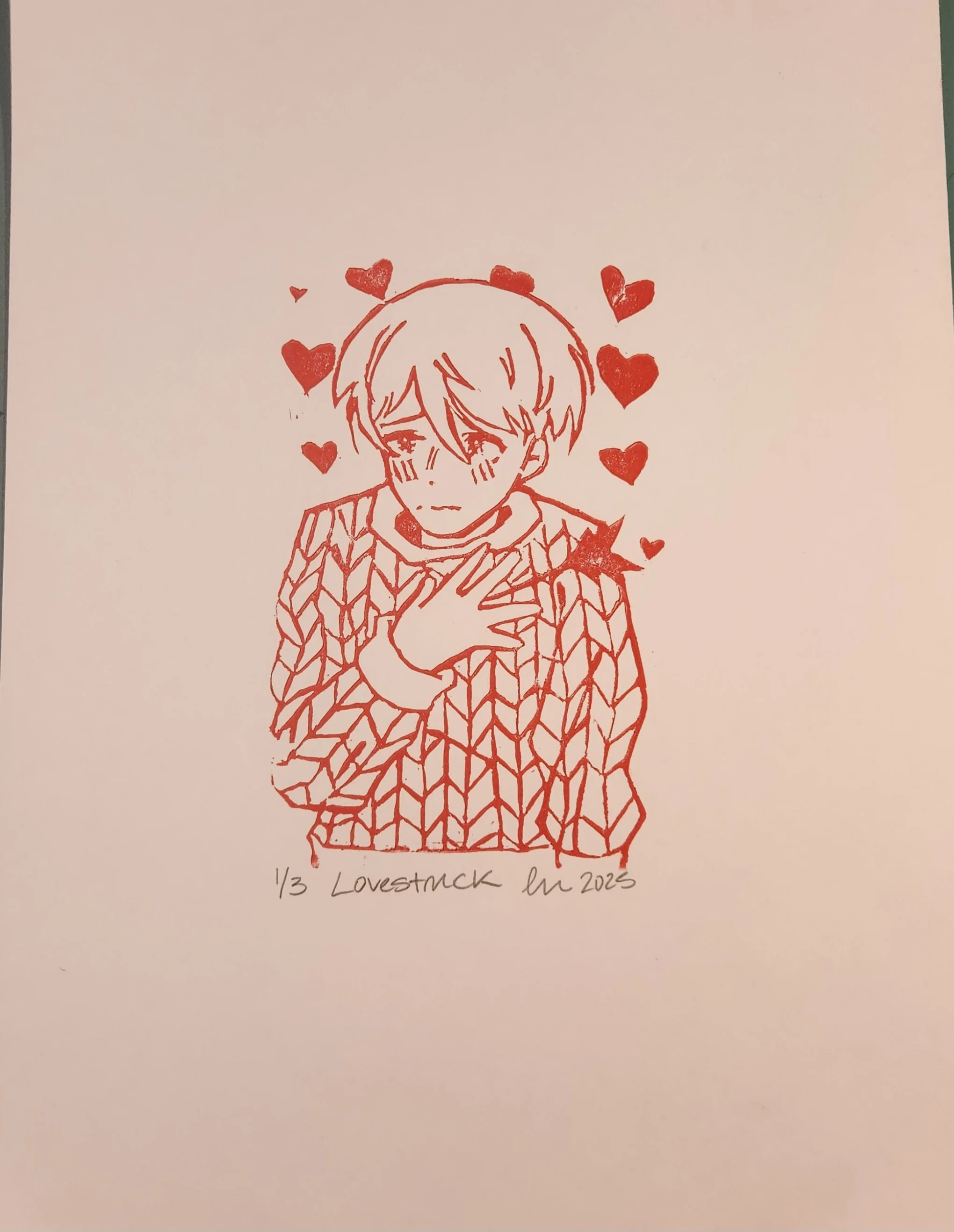
Emotions are daily life. Every time we need to express something in ways other than words, emotions can help. They can reveal things we have never thought about ourselves, and help us better understand what makes us, us. In each of my artworks emotions take the center stage, initially through simple emotions like joy, anger, and sadness, and gradually to more indistinguishable and abstract like uncertainty, or specific fear for oneself. I want the audience to look at my artworks and take the time to understand how feelings can symbolize more than just a feeling, but how the experience can augment the feeling. Every artwork in my exhibition explores some symbol or motif that is evident since I wanted to make sure the audience has a clear idea of what emotion is being portrayed. To give an example, my artwork Lovestruck, an arrow, is used literally to portray being “shot in the heart” by love, like being struck by Cupid’s arrow. For me, three dimensional artworks are hard for me to fully realize my intentions with emotions, since they are so abstract for me as well, so I kept my exhibition mostly two dimensional and with conventional mediums such as acrylic paint, colored pencils, and watercolor- watercolor being the most prominent medium I use in my artworks. Relating to my artworks, watercolors are loose and can be easily manipulated how I want them to.
For my exhibition, the layout plays a key role in how I want you, as an audience to perceive my artworks. In the center of my exhibition, is the artwork, Exposed, embodying the feeling of being naked to your emotions. I wanted to have this artwork be the centerpiece because it represents me, as the artist, exposing myself to the audience. One of the most important aspects of my layout is color balance between all of the world. I noticed in most of my artworks, there are the prominent colors of blue and red, as well as their mixture, purple. I wanted to make sure they were equally represented on each side. I placed the two artworks with a prominent purple on the opposing sides of the center piece, Dissociation being on the upper left hand corner, and Grief being at the lower right hand corner. For the artworks with prominent red, I attempted to place them in the middle above and below the artworks with prominent purple. As with artworks with a prominent blue, I did something similar putting them in the vicinity of another artwork with blue, and near the artworks with purple. This arrangement makes it easier to naturally follow the path of the artworks, and guarantees that there is no overbearing color, making the arrangement unbalanced. In addition, with this arrangement, the feelings are arranged relatively evenly between stronger emotions like grief and more everyday emotions like anger. I wanted the audience to not feel overwhelmed when looking at the arrangement of artworks, and to create a sense of impact for the audience. The audience should understand from my exhibition that every person is capable of feeling a myriad of emotions, not just surface level emotions.
When creating these artworks I had the worry that my audience would not be able to relate to the feelings that I have personally felt, so I had to think about how to generalize my feelings to make them more relatable for the audience. I tried to achieve this by making some of my artworks more impersonal, rarely portraying myself in any of my artworks. Only one of my artworks portrays myself. In Doors my main inspiration was my overall anxiety for the future and inevitable change in my life. I decided to use myself as the figure in the artwork because I thought that would be the easiest way to relay the message of my artwork, and I want the audience to see themselves in me, as with all of my artworks.
Gallery - Emotions
-
![]()
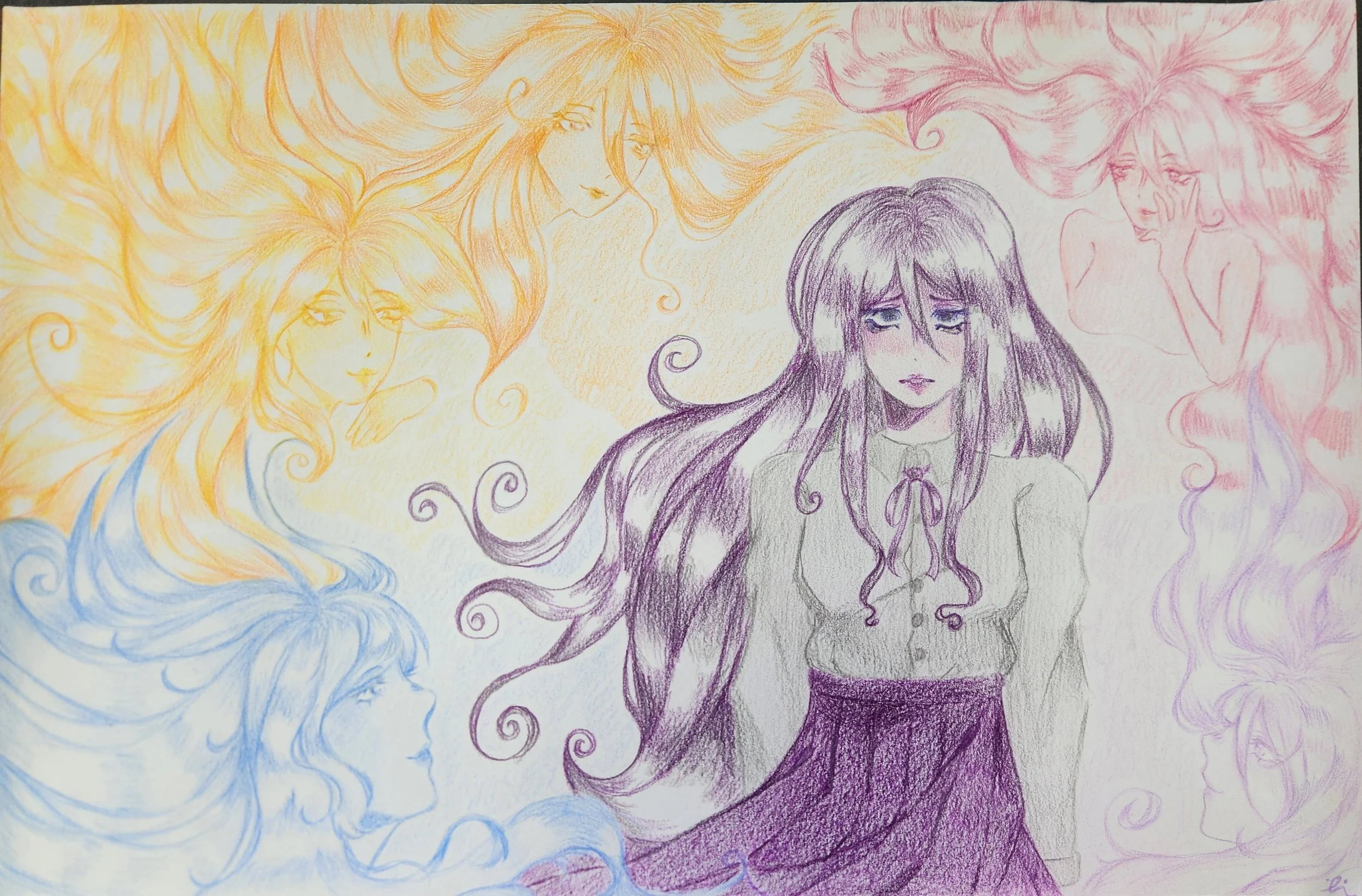
Dissociation
Ingrid Noreen
Colored Pencil on Paper
45.7 x 30.5 cm
2026
For this artwork, I was inspired by the feeling of dissociation, or when you feel out of body. I wanted to make an artwork that simulates that feeling. The central figure in my artwork is the main subject. I decided to portray her using very dull and contrasting colors compared to the outer figures which are depictions of her outside her body. For these figures, I wanted them to have a light, dream-like palette and have them swirling around her, so I used a spiral composition.
-
![]()
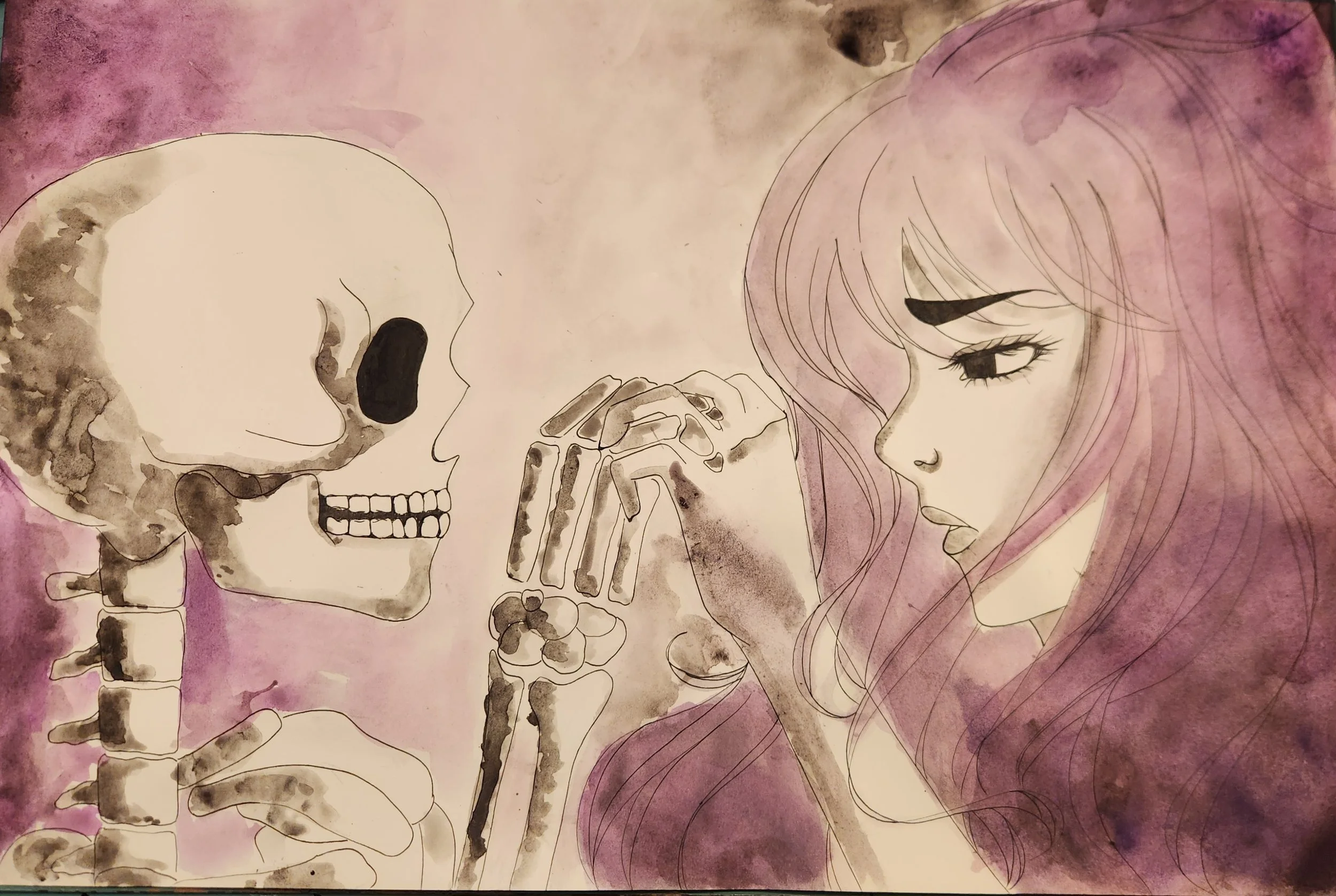
Grief
Ingrid Noreen
Ink and Watercolor on Paper
45.7 x 30.5 cm
2025
For my project, I was inspired by Belladonna of Sadness, an animated movie from 1973. The movie explores themes of grief, loss, and sadness, which I wanted to show in my artwork. I decided to also make my artwork in the style of the movie with watercolor. The artwork portrays two figures: a woman, and a skull who are clinging to one another’s hands. I wanted these two to represent how connected we are with death, especially when it is someone we know or love.
-
![]()
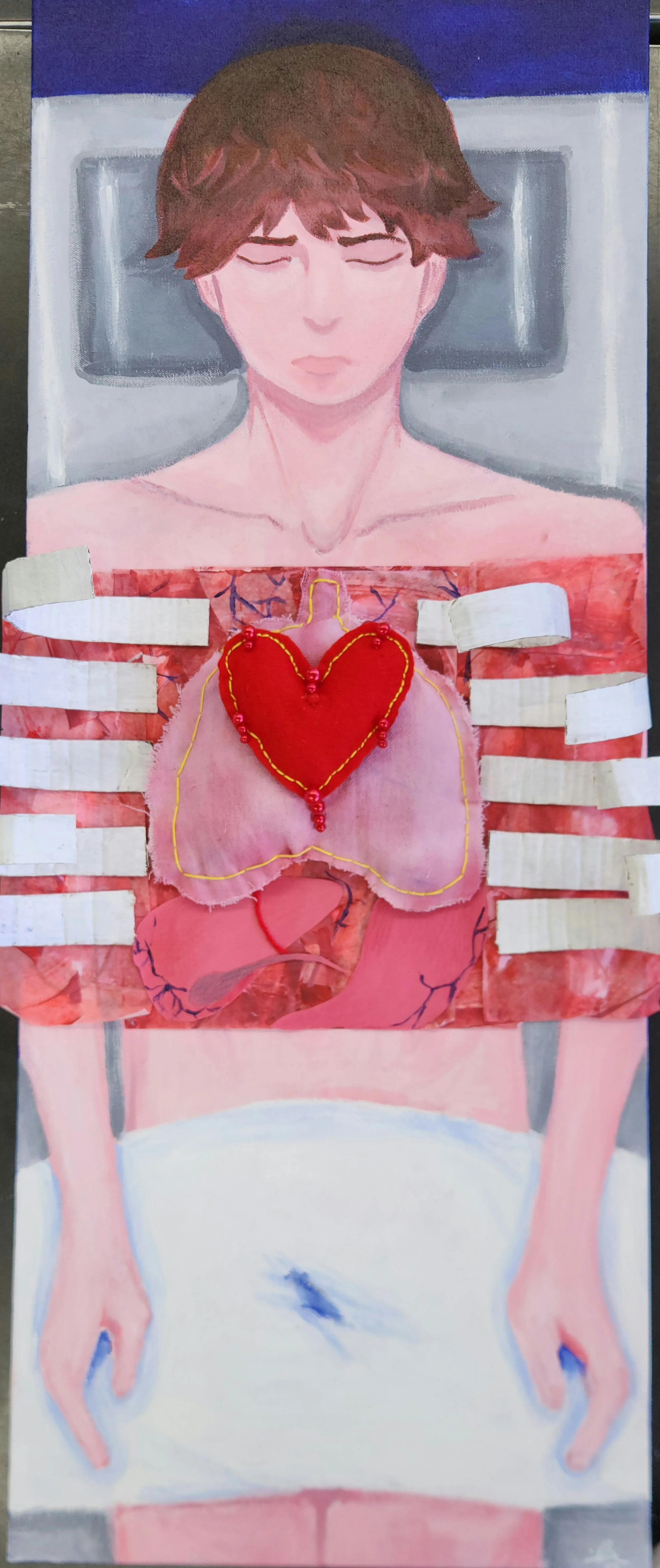
Exposed
Ingrid Noreen
Acrylic, Paper, Fabric, Colored Pencil, Beads, Paper on Canvas
101.6 x 40.6 cm
2025
For this artwork, I was inspired by Le Consolateur: manichini by Giorgio de Chirico because of the expressiveness and the similarity to my theme. I wanted to portray the feeling of being exposed, so I went with a literal approach by depicting a man on an autopsy table with his organs exposed. I used acrylic paint for the figure as well as the background. I used sewing materials, paper, and cardboard to create the organs and rib cage as my 3D element.
-
![]()
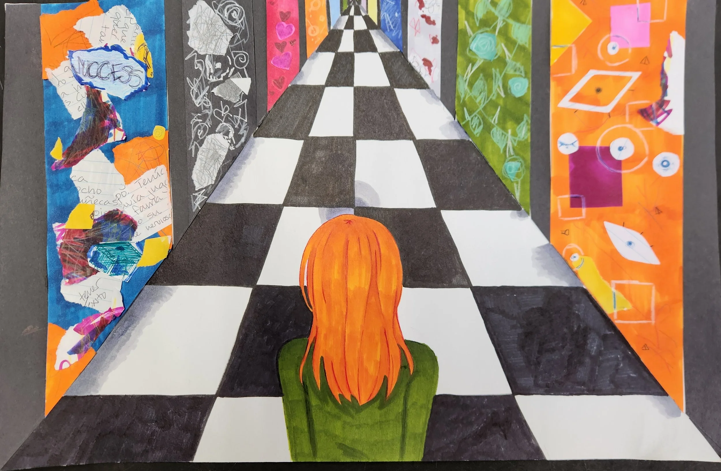
Doors
Ingrid Noreen
Paper, Pencils, Markers, on Paper
45.7 x 30.5 cm
2025
For this artwork, I was inspired by the concept of doors leading to your future and the general anxiety I, and many others, feel about our future and successes. I wanted to show this feeling of anxiety by making a narrow hallway and an overwhelming amount of doors before myself, representing the vast number of outcomes my future could potentially have. I wanted some of the doors to hint at what might be behind them, like the door with success written on it and one with blood, representing death.
-
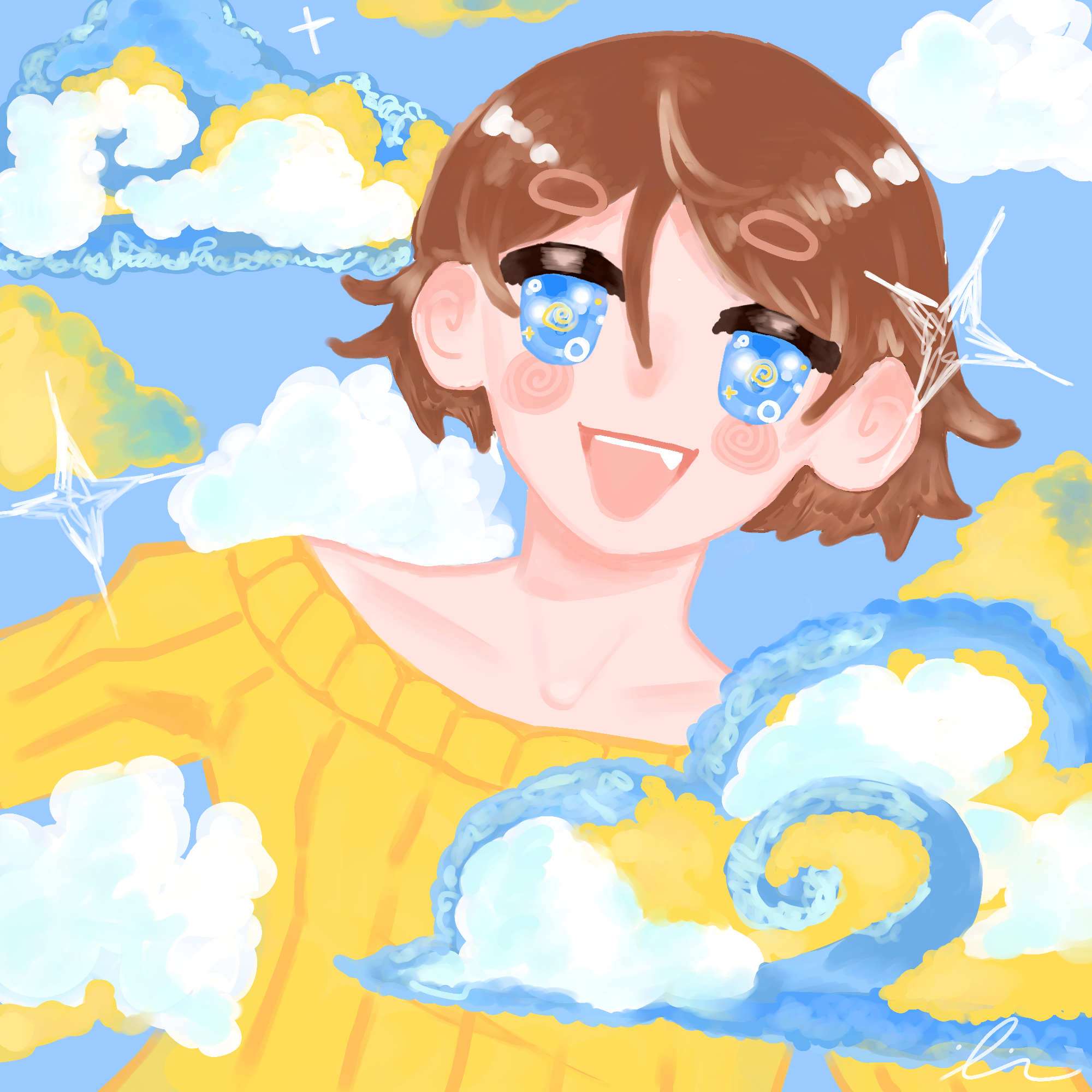
![]()
Cloud 9
Ingrid Noreen
Digital Art on Krita
2000 x 2000 px
2025
For this artwork, I was inspired by the painting Blackberry Picking due to its lush texture and more impressionistic feel. I wanted to portray the feeling of being so overjoyed you are on “Cloud 9”. I chose to use a very pastel and light color palette in order to show the brightness of the emotion. I used soft shading to make the artwork appear softer, like a cloud.
-
![]()
Lovestruck
Ingrid Noreen
Linoleum Print on Paper
21.6 cm x 27.9 cm
2025
For this project, I was inspired by Cupid and Cupid’s arrow. I wanted to use the expression “being struck by Cupid’s arrow”, meaning that you’ve fallen in love with someone, especially if very quickly. I planned to make a print of a boy who has been struck by a cupid's arrow. I decided to do linoleum printmaking for this project because I had a lot of fun on a previous project with the medium, and I wanted to challenge myself to make a more intricate design this time.
-
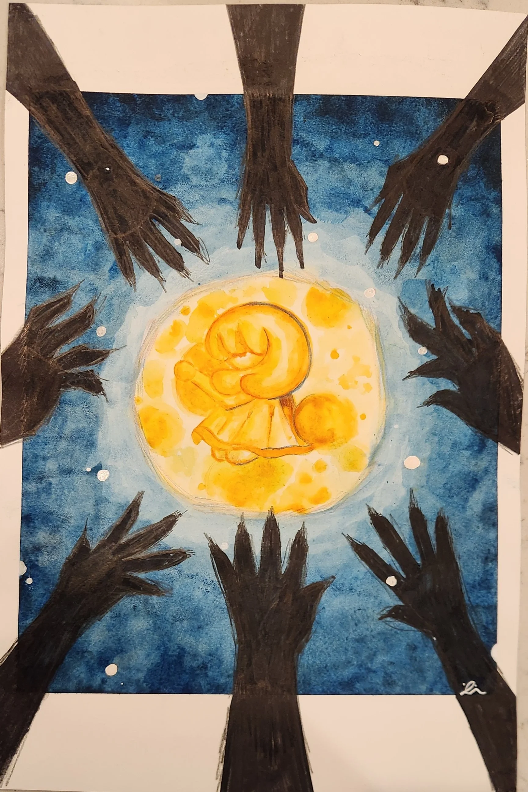
![]()
Clinging to Joy
Ingrid Noreen
Watercolor, Colored Pencil, and Ink on Paper
45.7 cm x 30.5 cm
2025
For this artwork I wanted to portray a feeling of having small joys when you’re in a dark place. To do this, I focused heavily on using contrasting colors to show the differentiation of them. I used a warm orange to represent joy, and deep navy blue and black to represent deep sadness. I also wanted to contrast the emotions by using a softer style for the girl, and a harsher, messier style for the hands and surrounding areas.
-
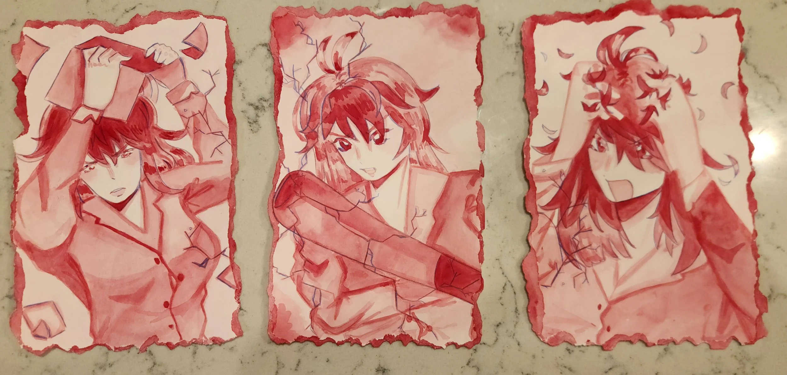
![]()
Rage
Ingrid Noreen
Watercolor and Colored Pencil on Paper
14 x 22cm
2025
For my artwork, I was inspired by the feeling of rage and didn’t have a particular inspirational artwork. To show this I focused on the intensity associated with it. I created a tryptic showing a figure ripping out her hair, throwing a book, and smashing glass. I used a monochromatic palette; only using red to shade, then I added blue outlines to create contrast. I also ripped the edges in order to show anger, like you want to rip something up because you need to blow off steam.